3D Printing Explained
CREATIVE BRIEF
For this project I will be explaining how 3D printers work. I will communicate what extrusion based 3D printers do, how they work, what they can and can’t do, and the future of 3D printing technology.
First I will use kinetic typography to show the watcher what a 3D printer is, and how it is different from other additive processes, and what makes an extrusion 3D printer different then a laser or resin 3D printer. I will then transition to building a 3D printer from the extrusion head, giving examples of different types of filament that can be used from 3D printers. I will then show how a model is transferred form the computer to the printer, and then show the printer extruding the item in layers illustrating different kinds of support structure and brim structure and the standards used for personal printers. I will then talk about what kinds of things 3D printers are great for, and what needs to be developed more before we are ready to do. I will then give examples of some of the emerging technologies and materials in 3D printing.
The main techniques I will be using in this project is kinetic typography and the motion of simple, flat, brightly colored, shapes that make up the parts of the 3D printer. I will voice over the information provided so as to better communicate the information being presented. The tone will be cheery and hopeful and paired with upbeat background music to instill a inspire a sense of hope and wonder in those watching.
Anxiety Disorders Infographic
ANXIETY INFOGRAPH CREATIVE BRIEF
This motion info graph will be done on the definition, origin, causes, treatment, symptoms, and statistics of anxiety. Ideally I will be focusing on the data for American college students, but many of the studies have a much more broad group. I will now describe how I will complete this assignment.
To define anxiety, I will be using mainly typographic elements to illustrate anxiety through the shape of the words. The origin of anxiety will be demonstrated with minor animation: a saber tooth tiger turning into a paper. For causes I will again use some more animation techniques to visually demonstrate the symptoms. I would like to find, but have not yet found a data representation of what percentage of people’s with anxiety is caused by which factors, but I am convinced I will find it with enough digging. I will be doing a similar technique to illustrate techniques for treatment. Next, I will delve into that which what percent of the population has anxiety, and then highlight specific groups and the prevalence of anxiety within them.
I will be utilizing data from a number of reliable sources, namely on NIMH to illustrate how anxiety is distributed across the population, which populations it affects more than others, and how much of those people are receiving adequate treatment. Much of the data around anxiety is wether or not a person has anxiety, which type they have, and the duration of the condition.
All in all, I hope to to concisely convey the knowledge about anxiety. For so many, mental conditions, disorders, and, diseases are stigmatized inner culture. I hope to latest shed a little more light into grey matter with this video.
**I would like to note here, where I will not directly in the project that it is know that many people that should be diagnosed with anxiety are not, so the statistics are representative of only the diagnosed, not the people that silently struggle with the condition.
Person Motion Inforgraphic

Double Exposure
Gif

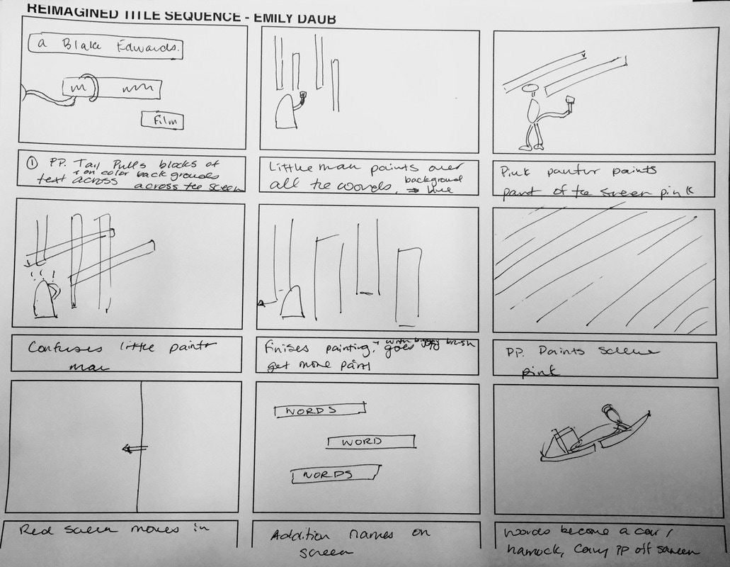
Pink Panther Title Sequence Reimagined
CREATIVE BREIF
In this project, I will recreate and modernize the original 1963 Pink Panther debut for our motion class. I plan on using a similar theme as the 1963 version, but with a slightly updated color pallet, cleaner lines, and more solid colors (as opposed to odd color gradients). The primary motion will be walk cycles of the panther and the other character. The other character will either be a painter or a detective (there are two versions of the title, one that has a painter, and one that has a detective, both with their merits). The interaction between the other character and the pink panther will be creating a color, and trying to erase the others’s color.
I choose Pan Panther because everything about it felt modern, except for the technology that was apparently used in its creation, its color, and its use of depth. But the music is phenomenal, the whole thing is simply animated, and now that is has been half a decade, it could use a revamp.
My goal is to modernize the Pink Panther title sequence. With its simplicity, the challenge will be found in finding creative ways to make the pink panther appear so slink around appear to slink around. I plan to achieve this by breaking him down into as many parts as I think I can control (ie. the tail will be 20 parts, the body 3, the feet 2…) and then parenting those to one another as we did with the old times walk cycle. With the amount of parts I have to control, I will be able to achieve the fluidity that is characteristic of the panther. I will also be choosing more simplistic solid color backgrounds. When the original title sequence was made in the 60s, everyone was about the gradient, which I assume is cause that was a way to demonstrate the talent of the animator. But more recently, the major trend in media design is to flatten everything. This can be seen in just about every app, and most typography design (missing the white space holes of the e, d, p, and os.
STORY BOARD
Three Second Rotoscope: Will B. Bell Choreography
Basic Walk Cycle
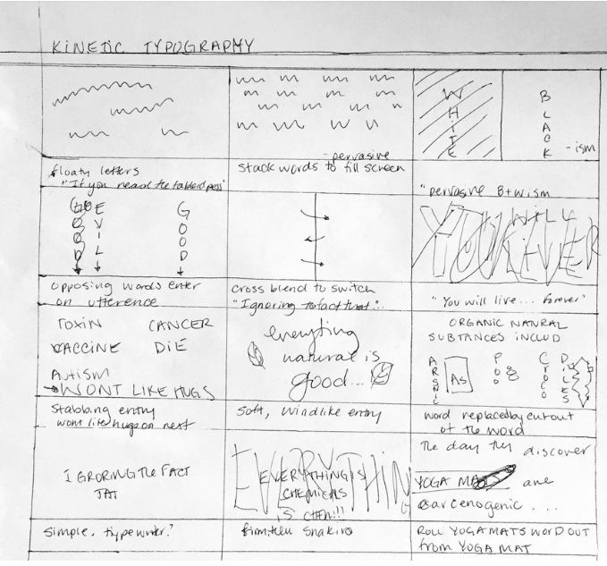
Kinetic Typography: Tim Minchin, the Fence Preface
CREATIVE BREIF
This project, as indicated by the title of the assignment is Kinetic Typography. Text moving across the page to words. The words chose for this project are those spoken by Tim Minchin as a preface to his song “The Fence.” In the audio, he speaks of peoples inability to see things as more than black and white, to acknowledge nuance; a lack of duality or intellectual bilingualism.
I plan to exhibit this through using almost only pure black and white to represent the the contradiction illustrated by the speaker, Tim Minchin. In the motion of the text, I plan to use a mix of striking and streaming lettering. Much of the time, the speak speaks quickly, and without much inflection to distinguish the words, except when it is done to make a point. So when Minchin speaks many words at once, they will stream onto the page on top of one of each other ((“if, if you read the tabloid press…”), only to be punched or pushed out of the way by the words that hold more weight, or have great inflection (“You will live forever!” “Everything is Chemicals!”).
I will use the motion of the text to create the striking and streaming effect. To make the striking text, the words will come in in very, bold large font, and some will shake: as if they were large rocks dropped on to your screen. The streaming text will appear with quickly, letter by letter, alternatingly being dragged quickly on to the page of being typed on to the page letter by letter. Occasional black or white geometric shapes will appear on the page to occupy half of the screen to continue to show the balance between black and white.
Overall, the use of motion will serve to emphasize Tim Minchin’s perspective that in order to make more sense, we need to realize that all thing are not just one thing; generalization is ignorant.
STORY BOARD