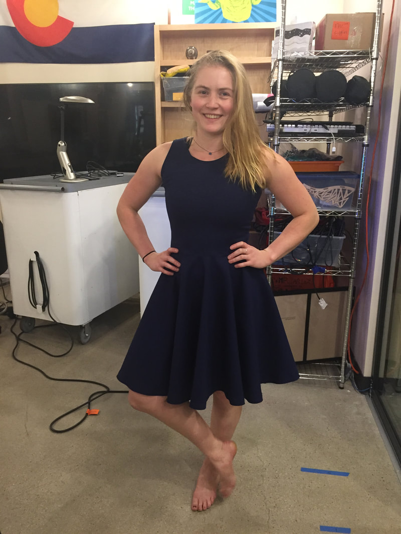
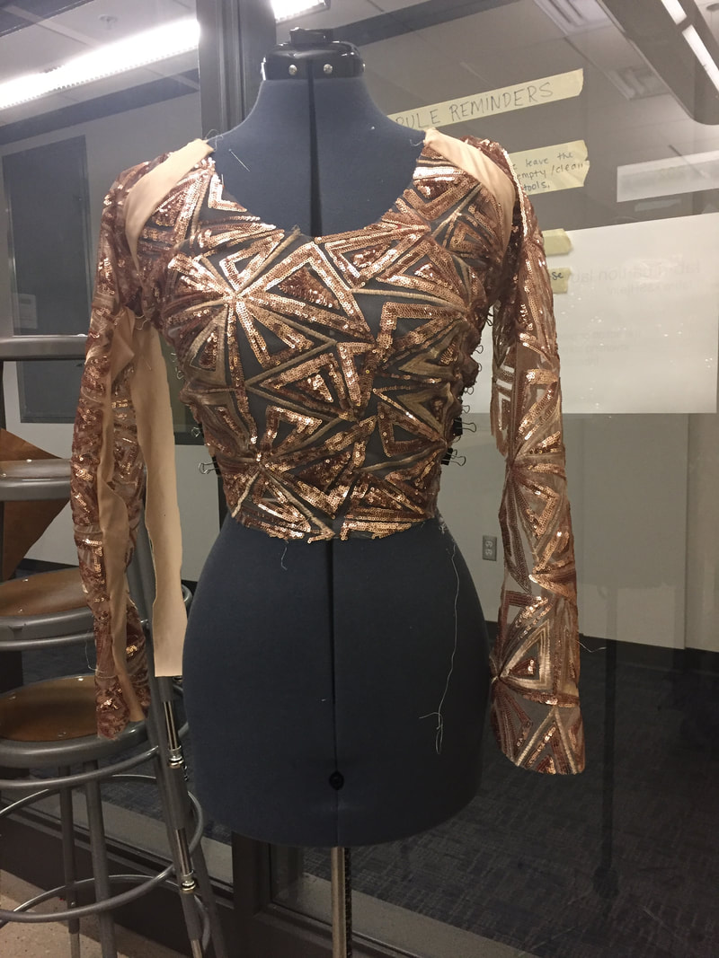
Dress Made for Meeting
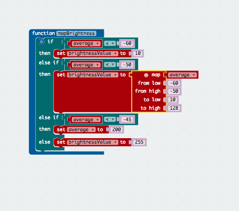
Went to the St. Julian to meet Micheal Savit and other members of the UROP team (the people who gave me the grant to do this project). I think it went really well, people seemed interested in my project, and I got a contact from Savit of a friend who owns factories in China, which will at the very least be interesting. I am curious about how garments are produced and I hope this will be a more real-world information. FUnction for brightness
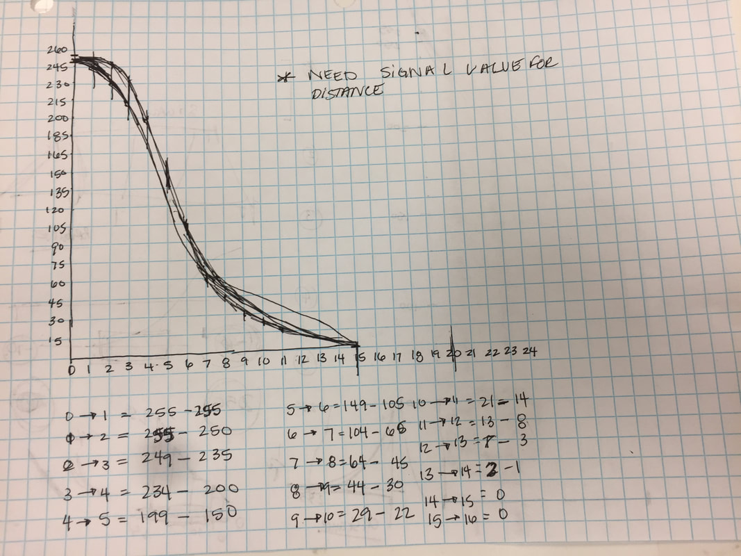
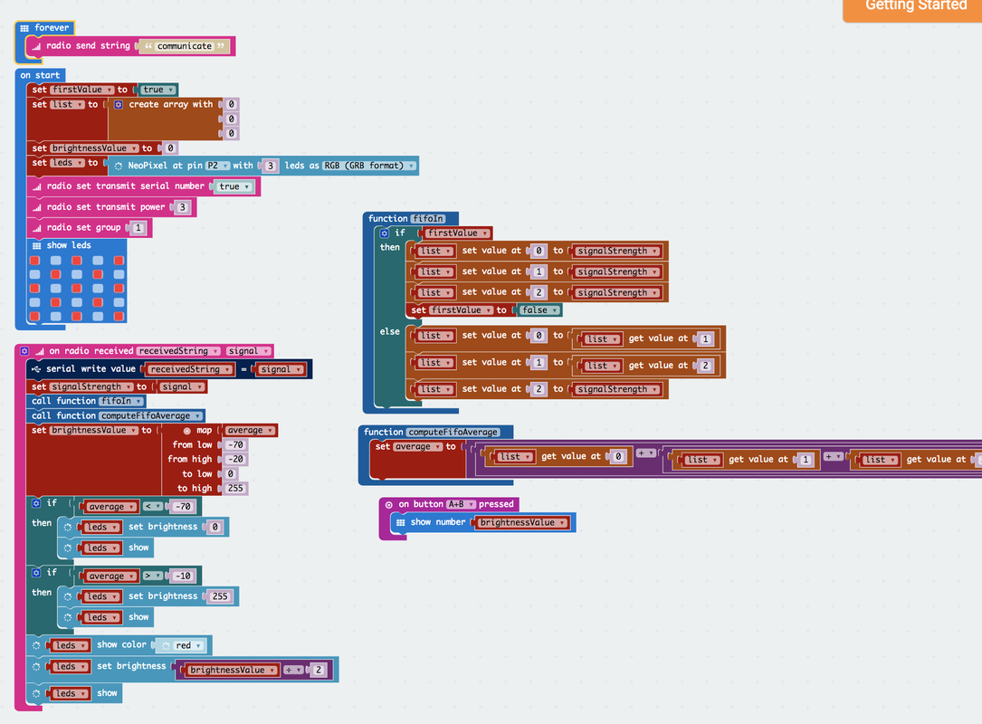
We worked out a few errors in the code, there is still the -works with last signal received problem, but that I'll fix later. This week I have been working on creating a better function for the brightness to create the effect I want. I drew a graph and then did the distance values, which I have from a chart I made a while ago, but need to update because I changed the signal strength... But thats just hours.
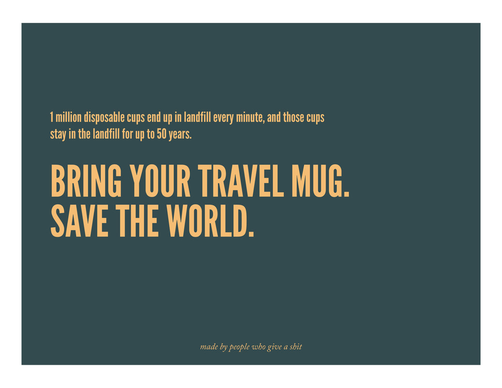
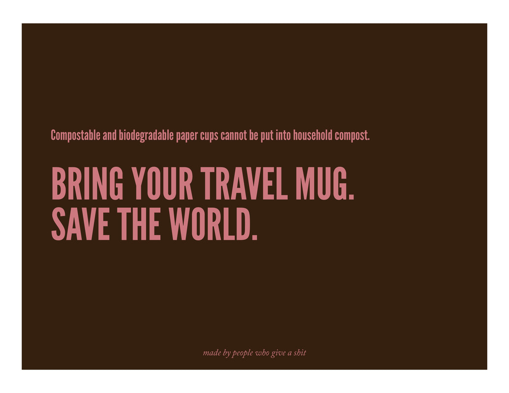
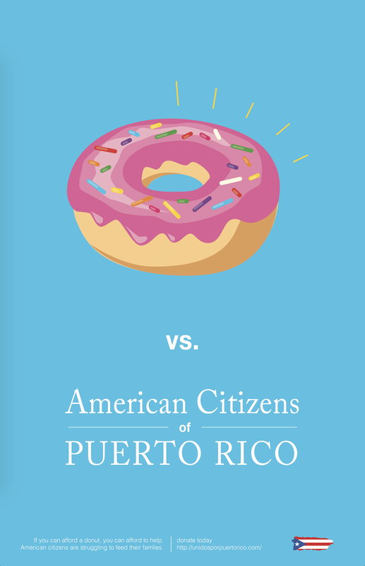
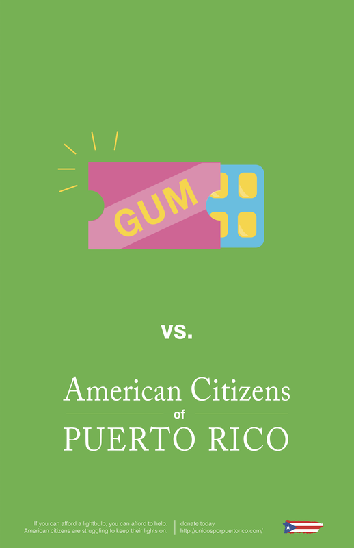
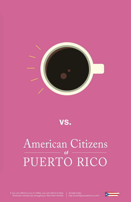
Final Posters: Square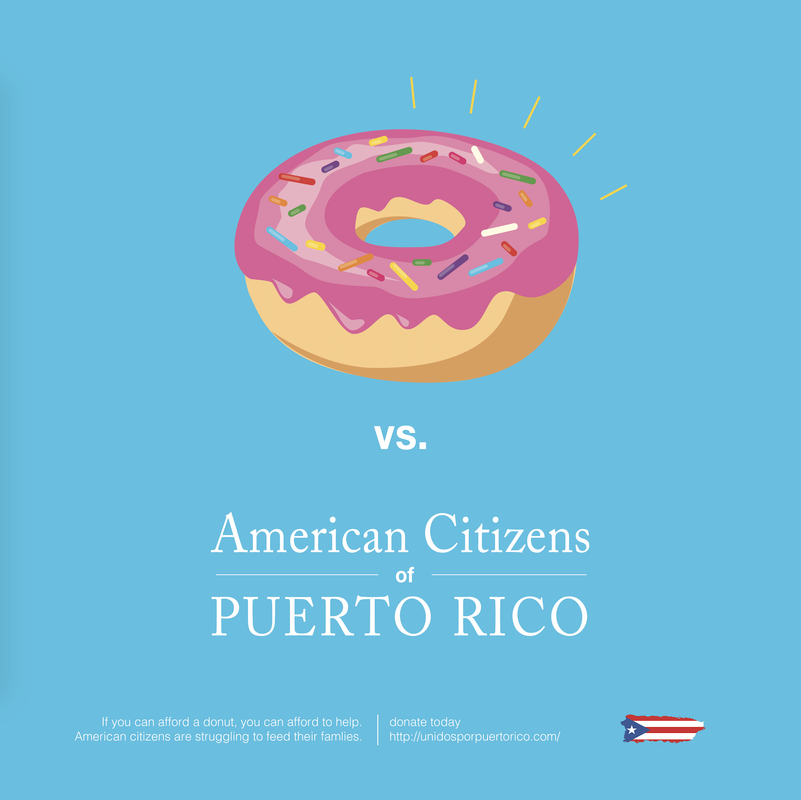 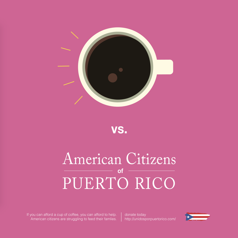 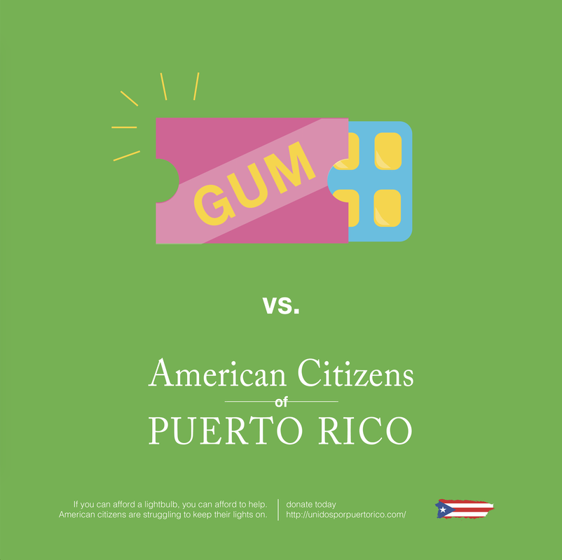 This project is over! Whew, I don't think I have gone through more major iterations on a project than this one in a while. I'm still not 100% happy with it, and I can't put my finger on quite why aesthetically, but it is turned and done, so I am feeling a little done with it. One of the other reasons I am not super duper happy with this project it because it deviates from the original message I wanted to convey. When we started the project, we agreed on the project topic of education about which territories the US has because of its significant influence on the likelihood of individuals donating to hurricane relief in Puerto Rico. It ended up being a more simple "if you have a few spare dollars to treat yourself, help out the people of Puerto Rico." While the poster says "American Citizens of Puerto Rico," which seems obvious, might not be obvious enough. The study we based out topic choice on provided the studied individuals with a paragraph about how Puerto Rico is related to the US. So I'd give it all like an 87% in my book, pretty ok, but also kinda meh. Social Media post I posted this on social media, with a little bit of engagement. People overall seemed to like it. Considering that the majority of what I post on FB is about projects I've done in school or work success, the bar might need to be a little higher than this solid "meh" rated project. POsters
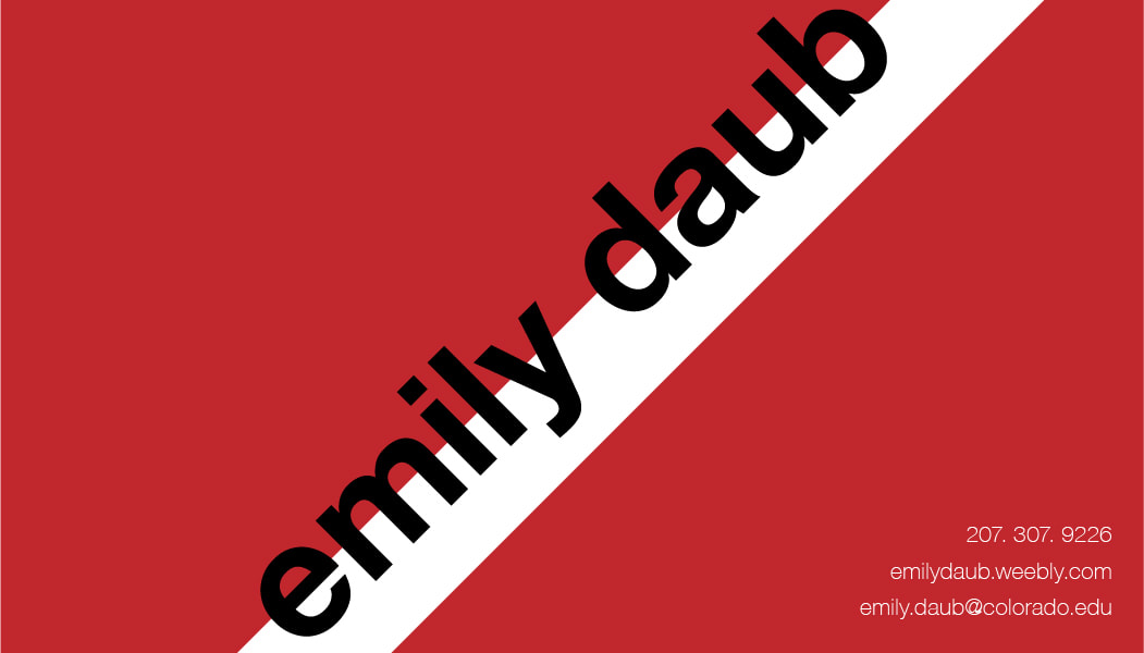
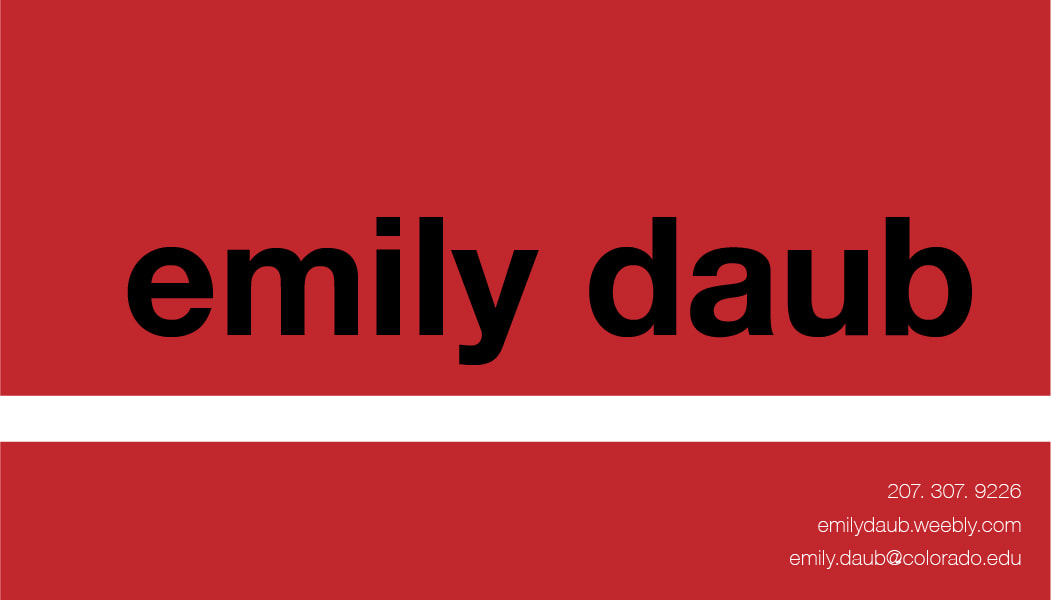
Final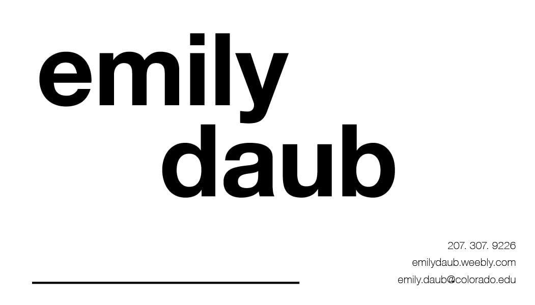 I love International Typographic Style; its detachment and directness. International Typographic Style (ITS) embodies what I try to embody as a person and in the design, I create when I get that freedom. So I had a great time creating these business cards, which came at a perfect time—I've been meaning to create a new one. With this one, I started with Helvetica. Then I added some color, as is consistent with me, I didn't like the color at all in any shade and removed it completely. The final version places focus on the whitespaces between the descender of the 'y' and ascender of the d. I also used lower case letters both because minuscule letters are characteristic of ITS and also because I hate capital Es and D's: they're vertically asymmetrical which I don't like in capitals (except in J and N). It also uses the dramatic hierarchy of ITS with the large focus and much smaller other information. A detail on this on that might not make sense here is the line at the bottom right of the card. This line is for me to fill in whatever the relevant description for the person I am giving the card to. Sometimes I'm a graphic designer, a wearables innovator, an apparel designer, and other things, and I wanted a place that I could make one business card could serve the multiple purposes I fulfill as a creator and designer. ITS also has such a void of voice that allows my different disciplines to be served by the same card, which is great. Iterations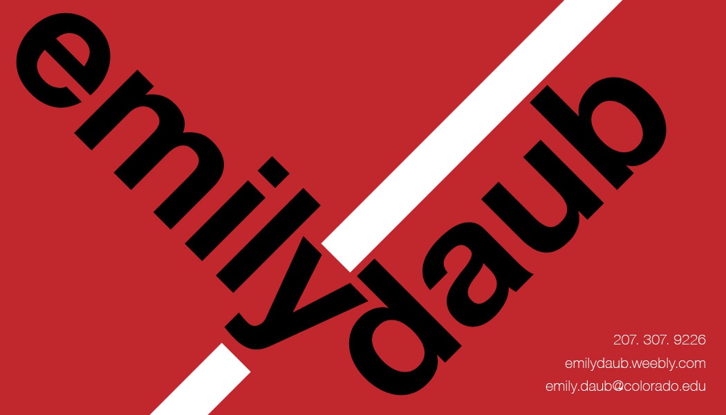
Last week we had like the second real discussion that we have had in class all year. I wish this class was more of that; a harder analysis on our ideas and the rhetoric around it, and then how to communicate that position effectively. I wish we could discuss topics in smaller sections: I think that would be more effective for getting students to talk to one another. With a large class, we really don't have time for everyone to state their positions and the reasons (or more often, the lack thereof), behind them.
That Christian guy really gets under my skin, mostly because of his fundamental misunderstanding of how the healthcare system works. Healthcare providers provide a service that they pay for. THey are not just giving away health care. You make a bet that you won't get sick or need healthcare, and then the healthcare company evaluates that bet and gives you a fee that you pay on a monthly basis, so that, in the case you get sick, that money goes to your health care. Meaning, sometimes the healthcare company lose the bet, which is why there are premiums because they won't have you go over however much you've paid to be worth. And that's not the best explanation, I know, but the Christian guy's logic was that the health insurance people are paying for your healthcare. And they're not. You are because you purchase health insurance. Now, it would be different to say that some doctors should be allowed to prescribe or not prescribe contraceptive measures, but that would go against HIPPA, to cause no harm and help to the best of the doctor's ability. I know my views are liberal in general, and I do wish we had socialized healthcare; I think it would be a better situation overall if we implemented it, in the same manner, other countries have before it, but I also try to examine my opinions. So there. My updated Version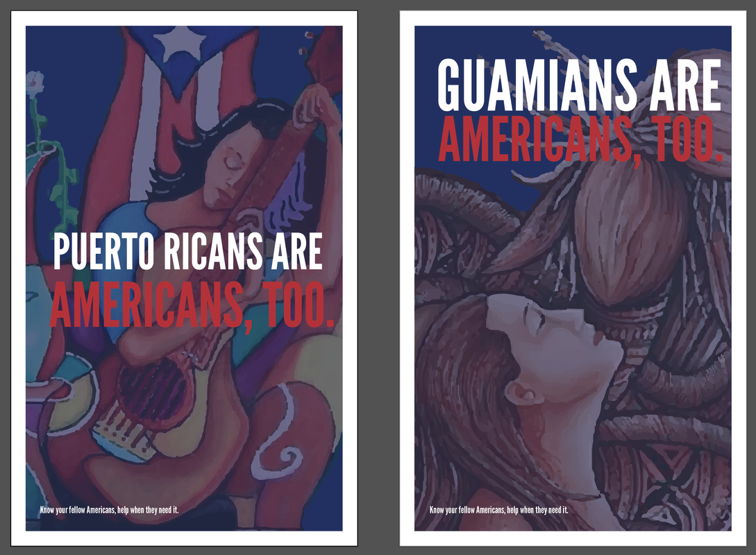 McCall's Version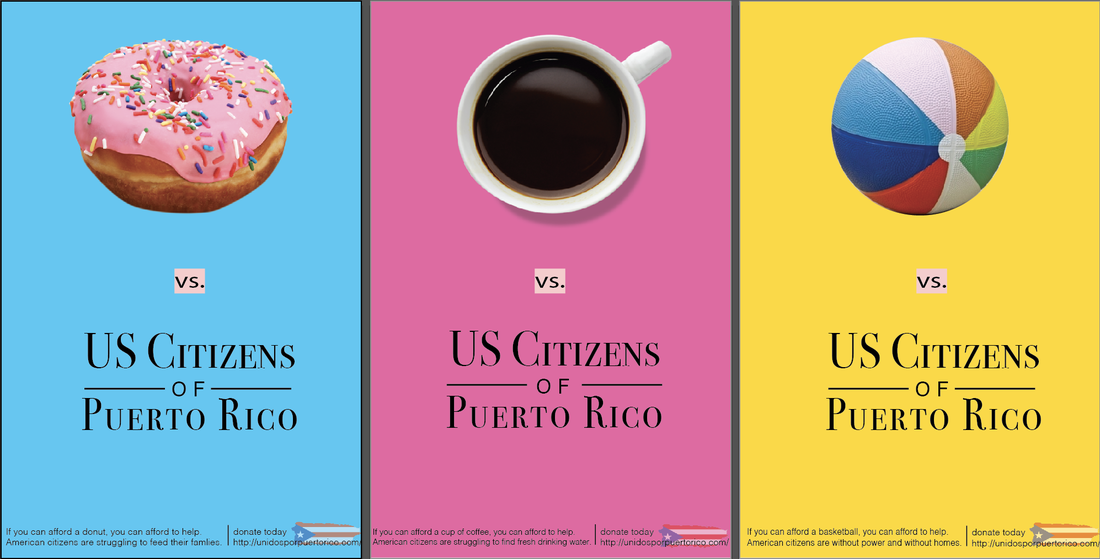 Round one posteRI updated McCall's poster, and refined the typography and changed the color (yellow never prints how you want it), as well as center the content tighter in the middle. 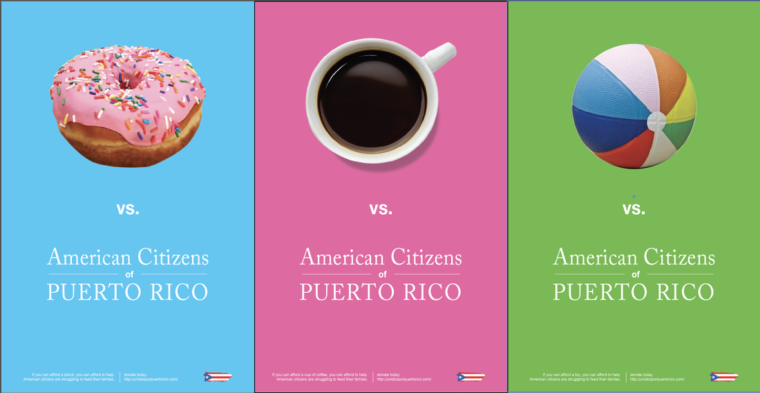 1.Three examples of typography tied to brand identity.
2.One example (at least 3 images) of brand typography evolving over time.
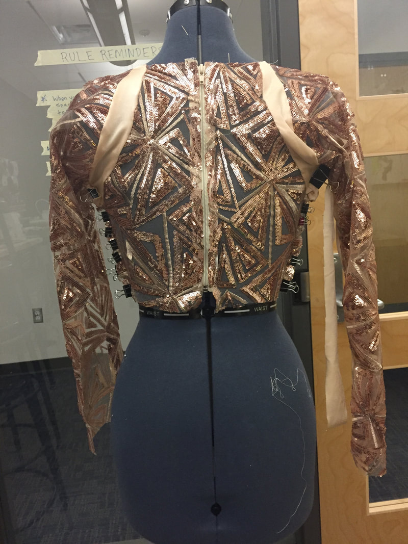
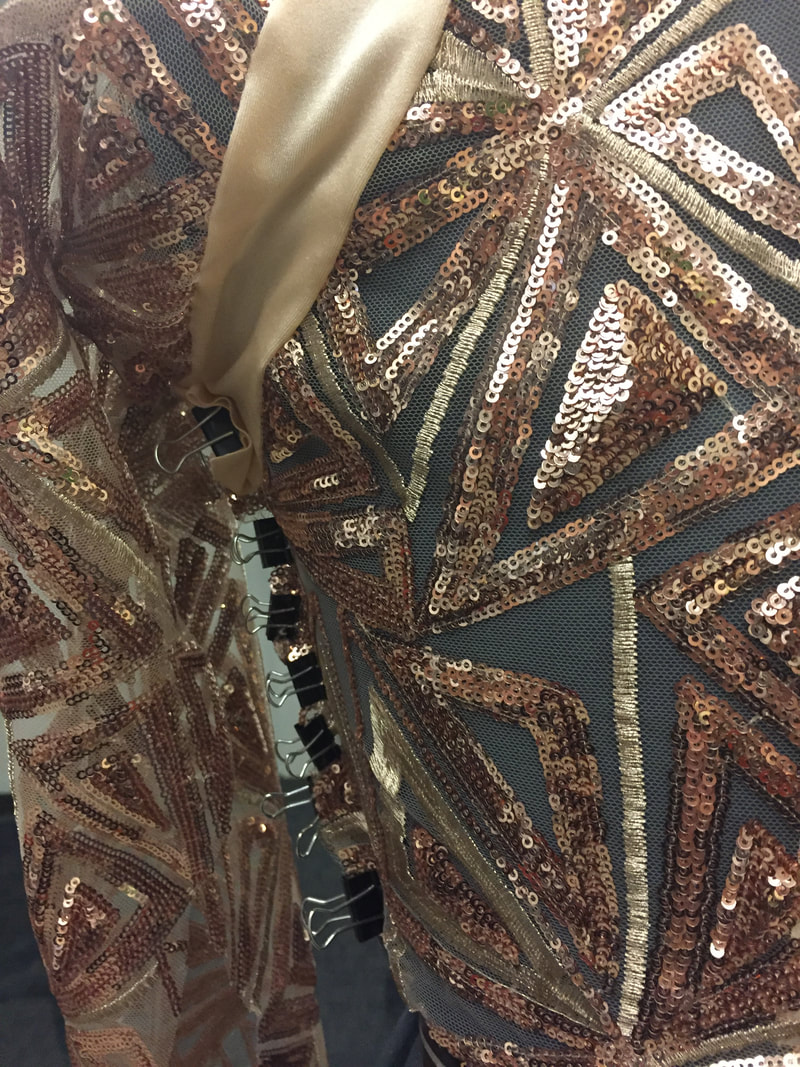
Aerial top
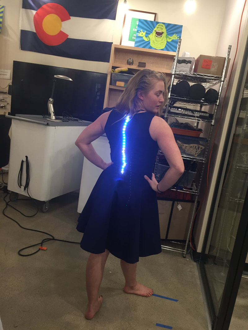
I completely cut the pattern. Which is terrifying. This fabric was quite expensive and I don't want to have to buy more... I decided on a raglan sleeve because I thought it would help with movement. I also haven't closed the arms yet so I can put LEDs on the inside of them. The sequin panels have some stretch but will have another layer of no stretch lining behind them with the LEDs on that layer, which is why there are lycra panels between the seams in the shoulders and on the sides to create stretch along those seams. The bottoms have been cut, but I haven't started to put them together. I wish there was a dress form for bottoms... Swing Skirt
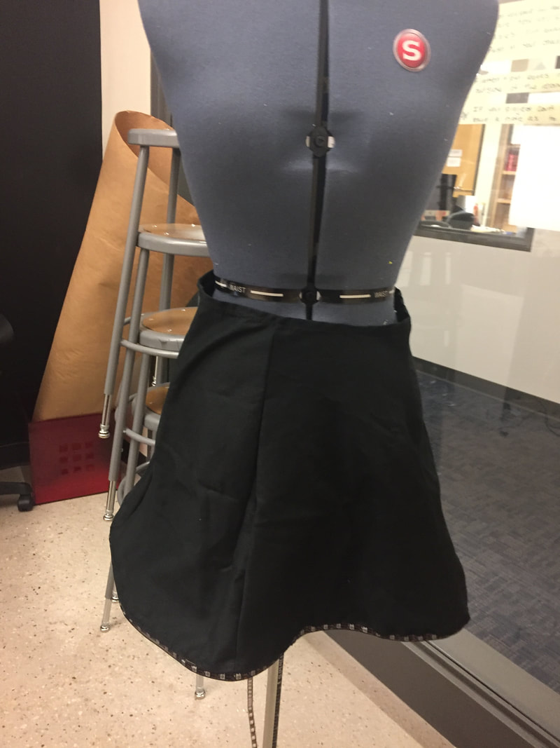
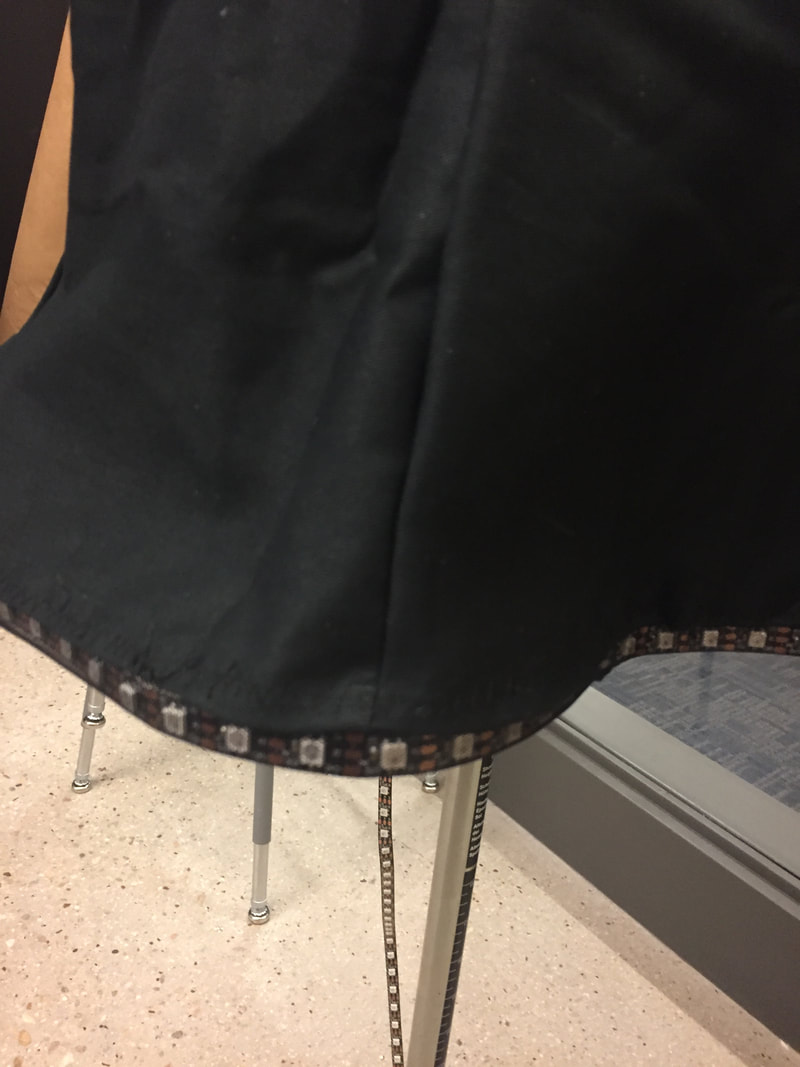
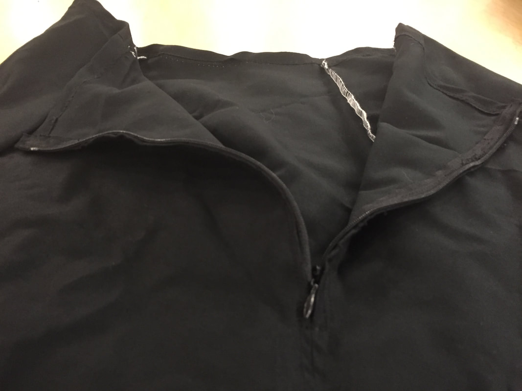
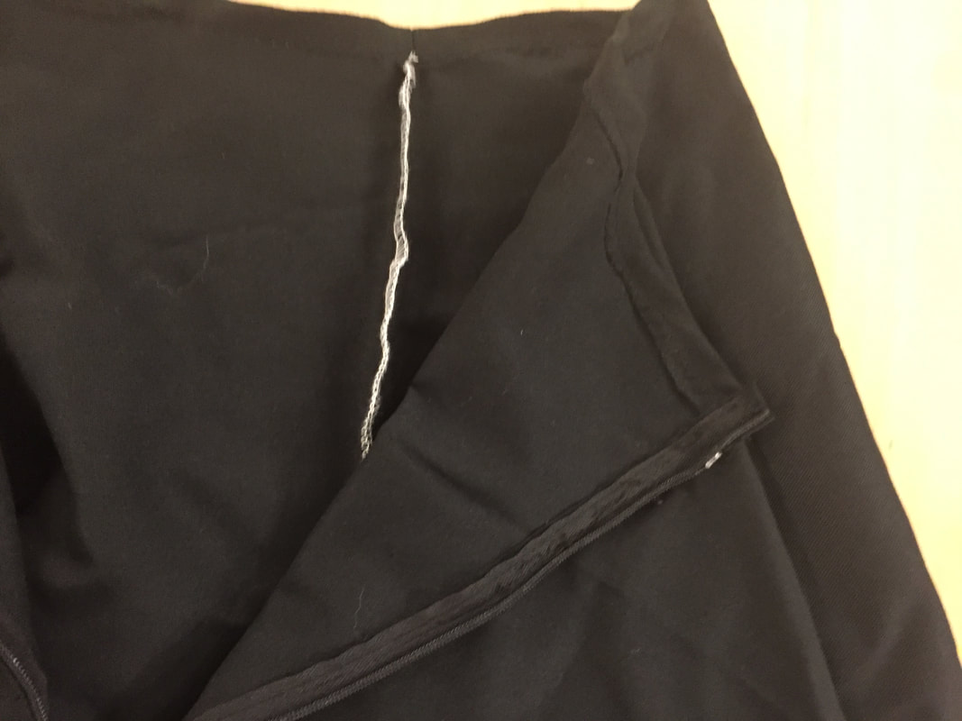
For the swing skirt, I used a simple A-line skirt (so popular with sorority girls on football game days these days), instead of-of the traditional circle skirt for swing dancers. I thought this would be better to pair with the house dancer because it was a more fashionable skirt for the times. For embedding the LEDs, I tried a new method, since the swing skirt isn't circle and won't flatten out when the dancer spins, I couldn't put them on the inside of the hem, and the fabric was too tightly woven to shine through the fabric effectively, so instead I made mesh pipping that I threaded the LED strand through, and stretched it to the hem. The only thing that is missing to completely finish this on is soldering the LEDs to the board and making a pocket for the board and batteries. Also, it looks like it fits a little weird on the model, but I made the waist a little bigger than the setting on the dress form when the picture was taken. This is so that if the dancer is bigger, It will fit, but if they're smaller I can size it down with stitching and adding elastic.
Up to this point, we have been exploring the history of printing and typography. Has this changed your appreciation for printing today? Has it influenced how you approach typography or design?
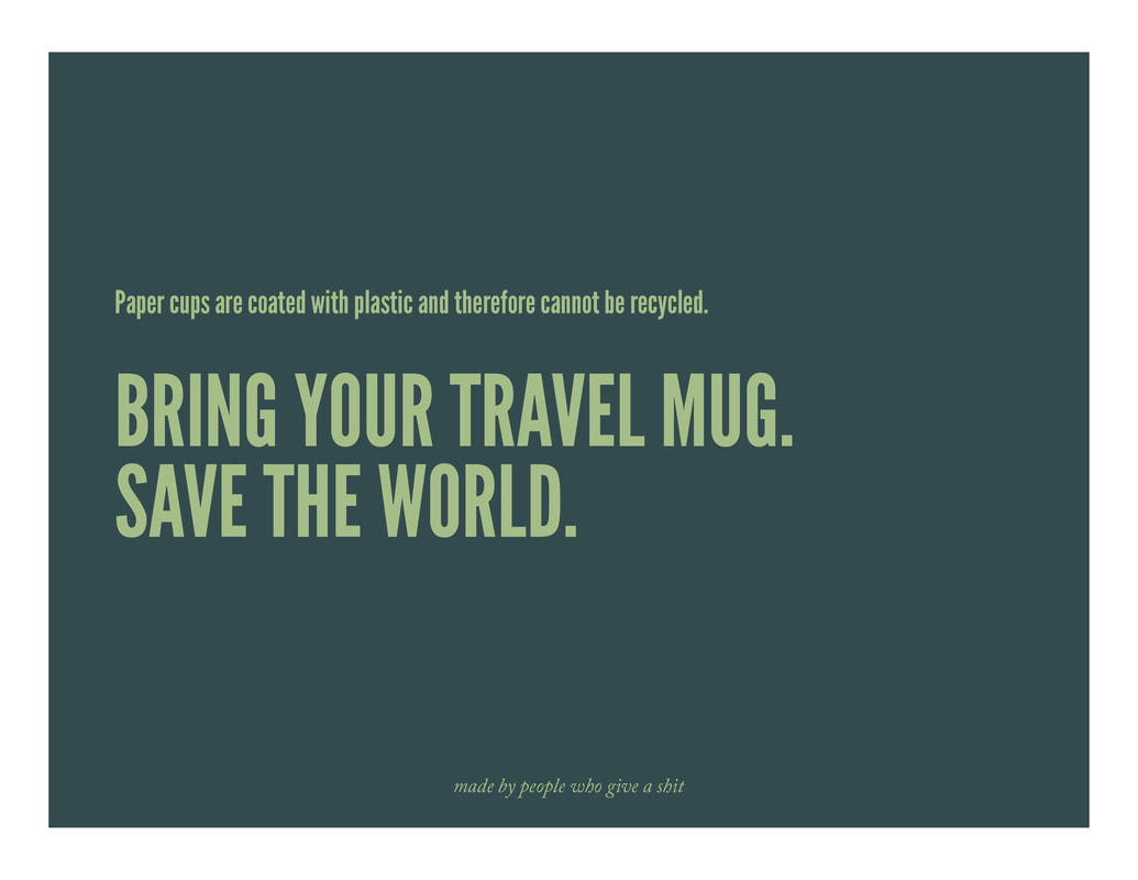
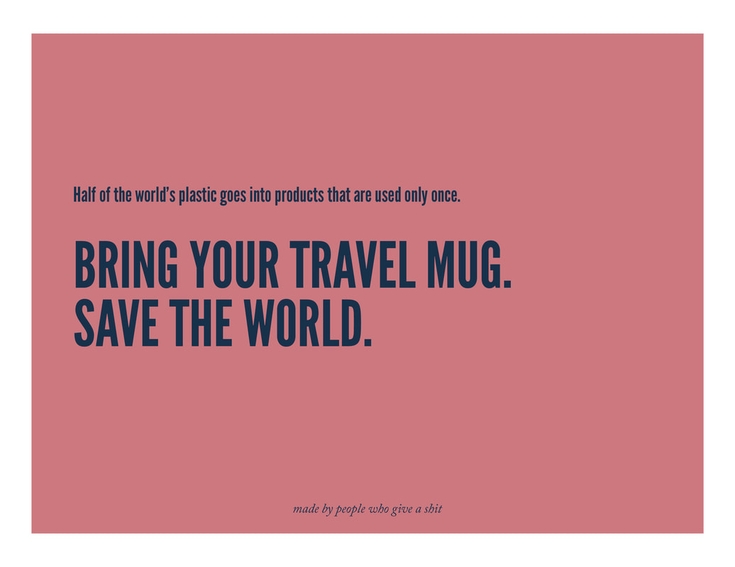
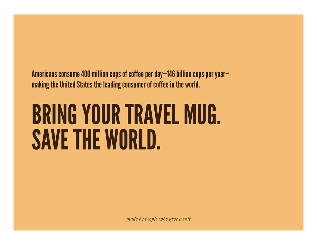
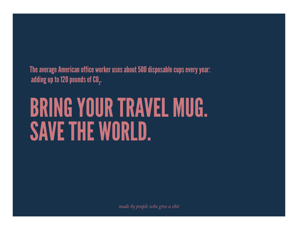
Answer: I have always been interested in the history of the things I like, which include mostly just objects: particularly clothing and stuff we use... like chairs and buildings. I took History of Design, History of Fashion, and history is mentioned in every single TAM class that I have taken in my time at CU, and I liked to think that I have learned a lot. However, in this class, I haven't really learned anything new that colors my perspective on design or has any particular influence on how I design now. I watched the Linotype documentary and haven't heard a new name, although I did learn small new tidbit like Gill San's creator's incest, but those haven't dramatically changed my perspective. Learning design history doesn't really change the way I work, but I make more decision more consciously. The more examples I see help me develop my aesthetic. I like Swiss/International Typographic style, and type-heavy everything. I hate unconsidered decoration and people trying to be too deep about stuff. Many artists try to make feelings, particularly negative feeling, so much bigger than they are and bigger than they deserve to be. It is self-indulgent and juvenile. I find this is design classes a lot, the fuzzy line between designer and artist. Sometimes design is art, and sometimes art is design, and other times they are both their own categories and don't need to be mixed. This perspective has come from learning about history and seeing what stands the test of time. Our group started talking about the topic that we wanted to do, with the constraint of needing to replicate the idea in a three-poster series. We settled on education about the US territories and letting people know about them. In primary education, we learn a lot about states rights, but we learn very little (or I remember very little) about US territories. In an NYT article, when asked if they would want to contribute to Puerto Rico if they knew that the people of Puerto Rico were American citizens, they were almost twice as likely to donate to Puerto Rico's hurricane relief. We wanted to spread awareness about our territories so that people would be more inclined to help their fellow US citizens.  I am American. White bread and white-bred. My parents are from America, and so were their parents, and my lineage can be traced back to the American revolution. I have a white name and come from an average, white, family.
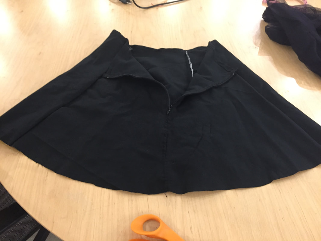
In the last two weeks, in to of my classes discussed parental heritage and its effect on our culture. In my Design for Change class, a group of students presented their cultural heritage through food and talked about the blended nature of the culture. The students in Design for Change presenting the cultural heritage I didn't disagree with (as there was no conclusion or thesis of their ideas), but they talked about the cultural duality. This is a concept I hadn't realized I didn't relate to! I had assumed most English speaking, accent-free Caucasian-ish (on the tan scale), wouldn't share a more similar background. Their pride in their cultures, made me think about my cultural heritage, how I define it, and what cultural heritage I belong to. In my hip hop class, the instructor talked about how no one is American; everyone is something American. Then saying that the only Native Americans can call themselves American (although would they? Their tribes are as diverse as European countries we distinguish between). So is there anyone that is American American? Because I feel like I am. Or more, I am not enough of one thing to call myself something other than American without being wrong. For example, I am a mix of German, English, one of the Nordic countries, and maybe Frace (based on what my mom has told me, and my features and stature). But I don't know of anyone in my family that is FROM any of those countries. I am not from anywhere more than I am from America. Being from somewhere to me would mean that that is where your most geriatric individual in your direct line (probably a grandparent, maybe a great-grandparent), was born in the same country you were. For me, this is true, but for a lot of individuals I know, it is not. Then, they are African American, Polish American, Irish American... etc. Otherwise, your cultural heritage is American and your ethnicity is different from your cultural heritage. For example, a Korean person who was born and raised in America has the race (or ethnicity) of Asian, but the cultural heritage of Korean American. The race of the person describes their appearance and physiology (there are slight differences between race based on the conditions of where they ancestors lived), where is their cultural heritage describes the kind of food they would eat, the music they listen to, how they dress and view themselves and others. But for me, my race is Caucasian, and my heritage is American. So should I be called Caucasian American? Or, because Caucasian is the dominant race in America is that a given trait, unless you specify otherwise, such as Japanese or African American? Would a white South African person call themselves African American? Why do we sometimes specify countries (French American, Argentinian American) and other times continents (Asian American, African American)? I don't have the answers. Right now, I am responding to what I hear around me, because I don't think I agree with something that was said, and I am exploring why. 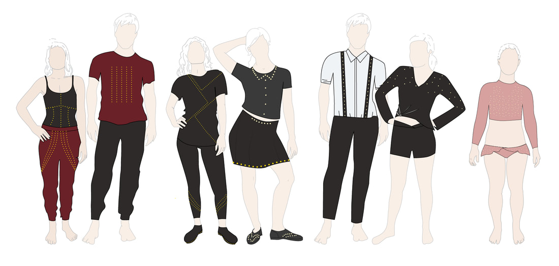 Swing skirt Sewing Finished
So far, I have done a lot of ordering of stuff. I also made a skirt! I wanted to test a new technique, specifically for the swing dancer costume, but also for future pieces, of creating mesh piping to sew around hems that encase neopixels. Since this is a costume rather than an everyday garment, the LEDs don't need to be quite as obtrusively hidden. In the mesh, they are partially, but not entirely hidden from view. THe other part about the real world progress is that I am trying not to sew as many of the garments by hand this time. Some costumes will be mostly hand sewn, but I am trying to find better ways to incorporate electronics into ready-made clothes. Code Progress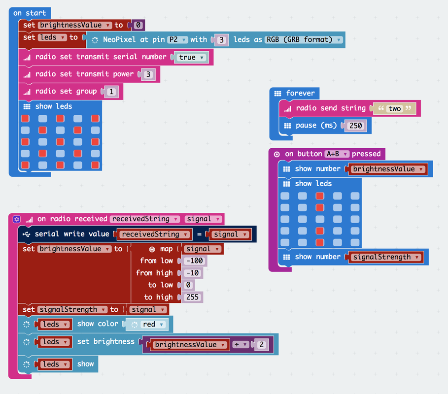 This code is supposed to use two Microbits, communicating with radio singles, light neopixels based on their proximity. Right now, this is technically working but will require more fiddling before it is exactly what I want it to be. The signal readings that the brightness respond to are a little in consistent, and I am trying to make the whole thing more smooth.  For this one, at this point, this is just test code. I was tiring to get the compass to work, and it doesn't work all that well, to fill bars on the MicroBit based on where you are facing when turning in a circle. It didn't work, but after more fiddling, we learned that it is because the Microbit's compass readings are about 30 degrees off in random directions for no apparent reason. We (Kari and I) used an iPhone compass pointing in the same direction as the Microbit, and the Microbit was consistently off.
 This is the final version of our stencil design.
We took off the sexual organs off of the people because any version of showing the undercarriage seemed to piss off some people, so fuck 'em. This is how we like it, and so it shall be. We took this and sprayed painted it on the wall (that you're legally allowed to spray paint on), and are going to put it on t-shirts frame the stencils as gifts. |
archive
January 2018
topics
All
|
|||||||||||||||||||||||
 RSS Feed
