|
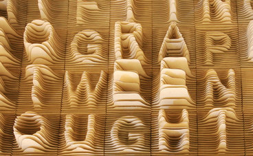
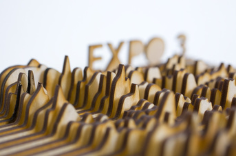
Assignment 4: Typography 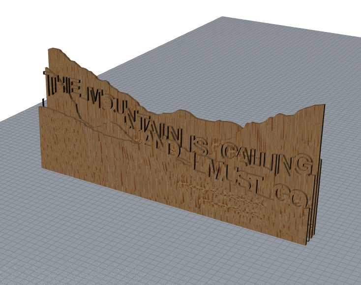 To give an idea of what this would look like cut out, I simply extruded all the curves at ones and put them on top of each other. Since this was made to be laser cut, not 3D printed, they didn't come out perfectly. As you can see with "The Mountain" layer. This won't matter, it was only as an example. The Inspiration
I like mountains. And I like the idea of taking 2D stuff and making it 3D stuff. I liked the way the maker of the topo alphabet turned 2D into 3D, and I liked how the mountains looked in the Expo 3. So I combined these two ideas, and put the words on the ridge of the mountains to be laser cut and then layered to create a field of depth with my favorite mountain quote from John Muir. The Process
0 Comments
After watching about 4 hours on watching tutorials and another 12 working on the project... It is done. Response to The Demise of "Form Follows Function", Dieter Rams: 10 Principals of Good Design, and Startups, this is how design works. If you took someone from the 1600s, and had them try to function a microwave, no matter how well designed, it still would be as difficult as an an iPhone. "Smart phones," although a brick of electronics with endless possibilities, do a good job of setting up the user to be able to function with little to no instruction. Although the physical form could me considered misleading, the majority of the functionality is with the form of the software in the phone more than the hardware. Personally, I've never read the instructions for my iPhone and operate it perfectly, yet have to ask my partner how to change the power level on our microwave every time I need to melt butter. While through the The Demise of Form Follows Function seems to assume us this would not be true and phones would be more challenging than a microwave, given that it displays form is as its function. On my phone, I touch to access apps, which then have more things to touch an move, with no instruction. Having been raised in the system, these things are never a struggle. Dieter Rams also commended Apple in the early 2000s for the design of the first few generations of iPod, saying that Apple was one of the few companies designing who were doing design right, which is very high praise.
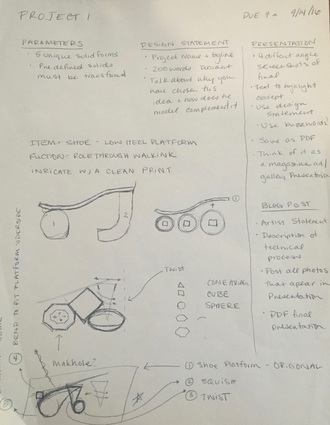
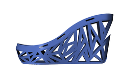
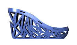
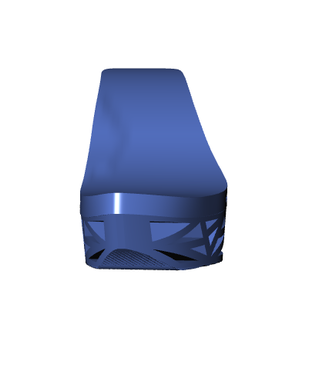
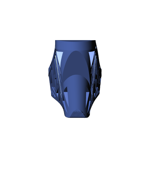
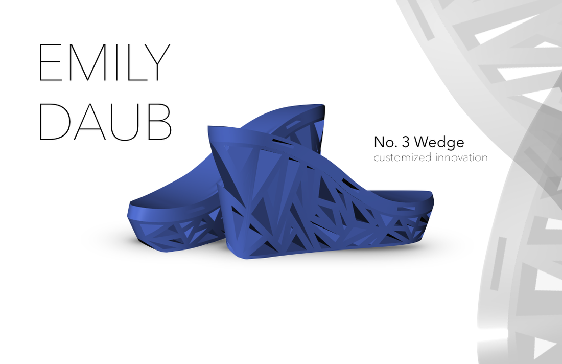 Artist's StatementWe’re able to easily purchase clothes tailored specifically to our bodies. However, with shoes, we still have little ability to customization for comfort. Ill fitting shoes have cased people pain to the detriment of soft tissues as well as simply appearing unattractive. The No. 3 Wedge, aims to correct the struggle between comfort and fashion by utilizing available materials, considering the wearer, and designing with intention. In the development of the model I contemplated the problems with the existing items. In traditional wedge heels, the heel is a relatively simple single shape blocks of cork, wood, or plastic. With 3D modeling and the materials available to 3D print with, we are able to create customized shoes to eliminate discomfort while expanding opportunities for creating beautiful designs. In designing the shoe, I designed for my own foot. The upper sole was created by tracing my foot, and the arc and curvature of my foot is accounted for, both of which are occasionally ignored or incorrect in heels. The shoe also has a role though design on the lower sole to eliminate the bent-knee walk often seen in inexperience high heel wearers. When there is no reliance on tradition methods, we are able to create with the user in mind.
Sketches
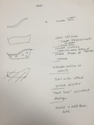
Technical ProcessAdditional Photos
Presentation Sheet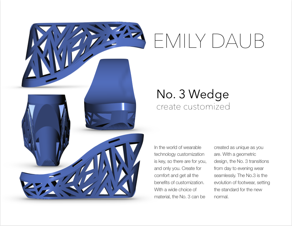
Get the file!
Wearable technology, as defined by innovative pieces put on the body to look good and/or function well, has been an integral part of our societal progress that has progressed slowly and steadily longer than any other field. But there are 3 major ways wearable tech will change by 2026; the change of the fabrics we have available, the expansion of electronics in everyday clothing, and body scanning to produce perfect fit clothes.
First, fabric. Wearable technology in a more broad sense importantly includes spandex, lycra, polyester, and knitting, sewing, and surging machines. Which have made phenomenal strides in increasing the wearability, and more specifically comfort, of everything we put on our body. Right now, we are adding to the list of textiles with the help of technology, which could also be called wearable technology. These consist of innovative uses of plant material and creative ways of reusing other exiting materials. They are also being expanded to include electronically powered textiles, for example, the fiber optic dress seen at this past year's Met Gala. By 2026, the cost of creating more natural fibers will all be on par with silk or will be lab created. We will need all the growing space needed coproduce cottons and linens will need to be devoted to growing the food not able to be created in a lab or housing. Most other textiles will be recycled to reduce the environmental impact of the clothing. Wearable technology so much as it exclude everything but items powered by or including electronics so far has existed only in accessories (see histories here and here) or what I like to call “body caps” (shoes cap your feet, gloves cap your hands, hats cap your head, glasses are caps for your eyes…). The technology we have available - namely sensors and lights - will soon be available in a small enough form that they will be able to be sewn into clothing as simply and unobtrusively as piping or bias tape today. This will allow us to have sensors to measure athletes, or people with cardiovascular conditions, or simply add lights to night wear for safety or fashion. These will only become a part of tech once we are able to have far superior waterproofing and flexible electronics and batteries. The third avenue of wearable tech that will likely be the least developed by 2026, likely only available to the upper class at first but then pollinating all stores, is body scanning. The body scanning will be used to perfectly fir clothing to you, either by electronic seamstresses or printed clothing. This will replace the couture (but not haute couture) and tailoring industries, but leave space for designers to become more inventive than every with style. This will usher in personal style designers, who might have otherwise worked for fashion houses. For the upper class, it will be like wedding dress shopping, but soon it will available at the 2026 equivalent of H&M or Zara.  Tim Minchin - Speaker This project, as indicated by the title of the assignment is Kinetic Typography. Text moving across the page to words. The words chose for this project are those spoken by Tim Minchin as a preface to his song “The Fence.” In the audio, he speaks of peoples inability to see things as more than black and white, to acknowledge nuance; a lack of duality or intellectual bilingualism. I plan to exhibit this through using almost only pure black and white to represent the the contradiction illustrated by the speaker, Tim Minchin. In the motion of the text, I plan to use a mix of striking and streaming lettering. Much of the time, the speak speaks quickly, and without much inflection to distinguish the words, except when it is done to make a point. So when Minchin speaks many words at once, they will stream onto the page on top of one of each other ((“if, if you read the tabloid press…”), only to be punched or pushed out of the way by the words that hold more weight, or have great inflection (“You will live forever!” “Everything is Chemicals!”). I will use the motion of the text to create the striking and streaming effect. To make the striking text, the words will come in in very, bold large font, and some will shake: as if they were large rocks dropped on to your screen. The streaming text will appear with quickly, letter by letter, alternatingly being dragged quickly on to the page of being typed on to the page letter by letter. Occasional black or white geometric shapes will appear on the page to occupy half of the screen to continue to show the balance between black and white. Overall, the use of motion will serve to emphasize Tim Minchin’s perspective that in order to make more sense, we need to realize that all thing are not just one thing; generalization is ignorant.
Response to Product Design posted on Dwell and the keynote speech "Why Design Matters" by Alain de Botton at the Democratic Design Days in Zurich in 2016.
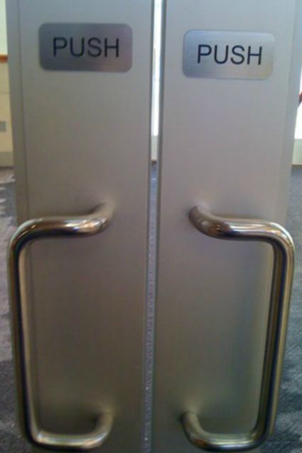
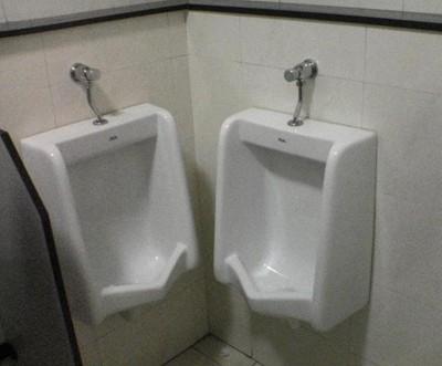
I laughed when in de Botton, noted that only in noting design at all do we mostly notice the absence of its excellence as I also find my self going around, noting in my head “design flaw!”. As said in the Design of Everyday things, poorly designed items are often in the world causing people to feel stupid. And as stated in both de Botton’s speech, the design of everyday things, and Dieter Rams’ second and fourth principal, The item should communicate its use. So then why in capitalist economies, where the best item/idea/design should be the most successful, why are we still surrounded by poorly designed things? Doors that when open, prevent other drawers and doors from being opened, faucets where you hands touch the back of the sink if your hand is in the stream of the water… Why have these prevailed? Both the Product Design reading and watching Why Design Matters kept drawing my mind back to Dieter Rams’ Ten Principals of Good Design, which I have copied below. On of the Dieter Rams principals I considered most is the good design gets out of the way, which is what I found to be true in many of the photos presented by de Botton. The examples he showed were clean, and simple and spoke to the purpose of the item rather than it as decoration. So again, why do we now see chevron everywhere, or in the 90s, the strange mix of primary colors and geometric shapes? Pattern and decoration date the when the item was created, and since we have realized this, why does it continue? My response is one of “what the hell, guys” that makes me furrow my brow and shake my head at people who intentionally choose items designed without consideration for their user in a way that quickly makes the item easily dated. They make it possible for bad design to continue to exist. Deiter Rams: Ten Principals of Good Design**These principles can be shared accurately and fairly under the Creative Commons CC-BY-NC-ND 3.0 license.**
Good design...
I am creating a kinetic typography motion project using the preface to Tim Minchin's "The Fence;" (full transcript below) a funny song about people lacking duality. I would encourage you to go watch ALL of the Tim Minchin comedic music on Youtube. 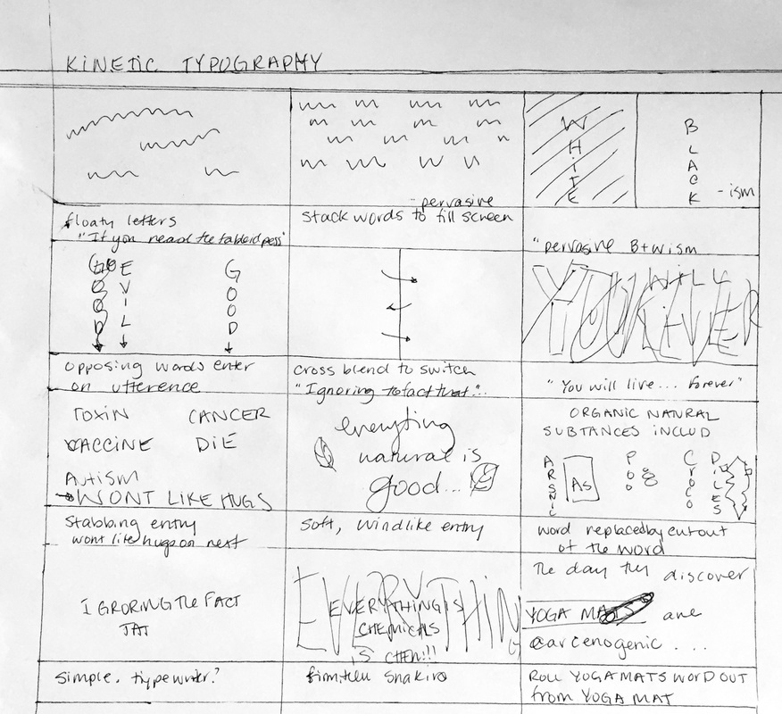 "If if you, if you read the the tabloid press... if you make the mistake accidentally reading the tabloid... maybe like the the front the top is rolled over something. If you read the the tabloid press or any of the letters in any opinion pages of the comments god forbid on any website it would be easy to become convinced that the human race is on a mission to divide things into two clean columns you know this sort of pervasive black and white-ism.
Everything has to be good or evil or healthy or deadly or natural chemical you know our troops in Iraq a good and pedophiles are evil. Ignoring the fact that some troops like kiddies and some pedos have guns and you know if you if you eat these berries or drink this juice you'll be miraculously health and you will live forever! But if you take this toxin have this vaccine you will get cancer and die! Or you will get autism and then you won't like hugs! And… You know everything everything organic and natural is good ignoring the fact that organic natural substances include arsenic and poo and crocodiles and you know everything chemical is bad ignoring the fact that everything is chemicals. Everything is chemicals! the day they discovered yoga mats are carcinogenic will be the happiest day of my life. " Tim Minchin Here is the beginning part before Tim Minchin's comedic song, "The Fence." It is a little long... But if need be, I can cut off the beginning and the end (the yoga mat comment), but I would rather not, considering it is so funny! 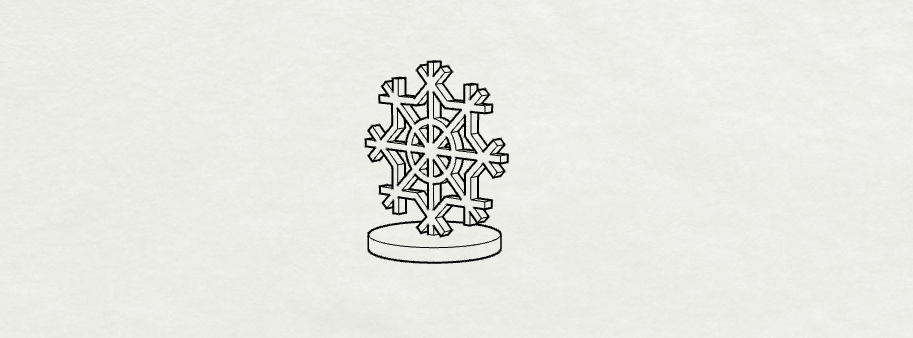
 I got carried away...Bored by the snowflake, I decided to make something slightly more challenging; a flower! It still fits in the given dimensions for the project, and should stand very well on its on. 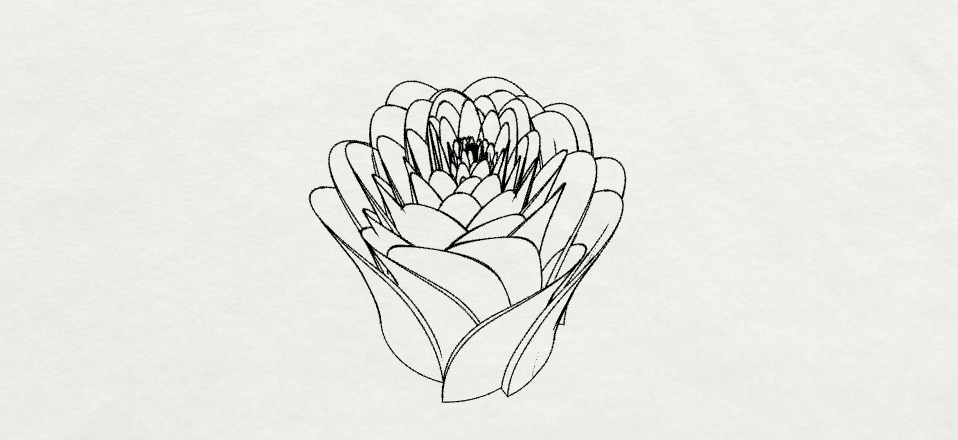
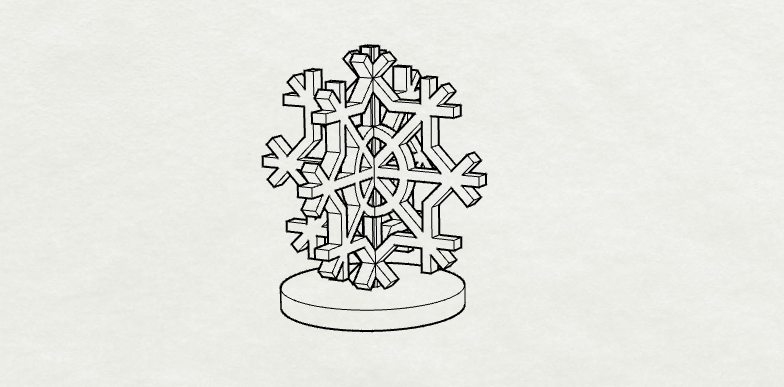
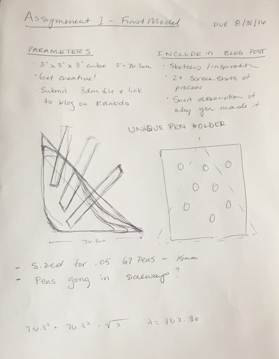
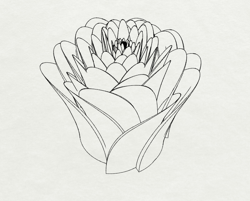 SketchesI am realized sketching isn't my strength for communication of ideas, because none of my initial ideas make it. The snowflake I liked, because it seemed to fit with other game piece type items; has relatively little complicated detail (perfect for the injection molding required to produce millions of little monopoly pieces). The crown on the pillow was going to be too stout for the dimension requirements... But once I was modeling, I got inspired. So these are my sketches: 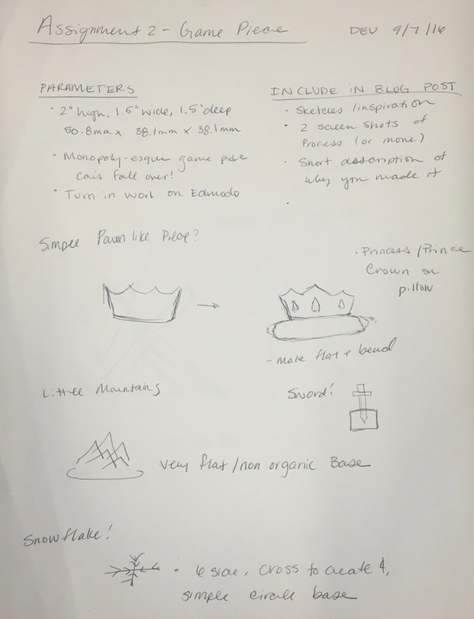 This is my first mini project in Adobe After Effects for the Motion Class at CU. Check it out: 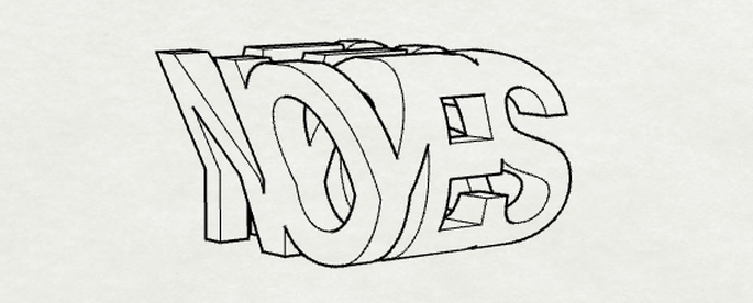 I have always really enjoyed art that changed depending on the perspective of the viewer; as I have found this is both visually interesting and great commentary on most of our interactions: it depends on how you see it. I started off with the idea of making a pen holder for my desk, where I currently have a stack of about 3 black G7 .5s, but didn't like how it was turning out, so I changed courses completely. As the instructions for this assignment were to "get creative!" I was also thinking this was a little more creative then a pen holder with clean lines. THE PROCESS
|
archive
January 2018
topics
All
|
|||||||||||||||||||||||||||||||||
 RSS Feed
