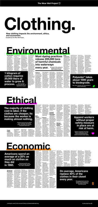
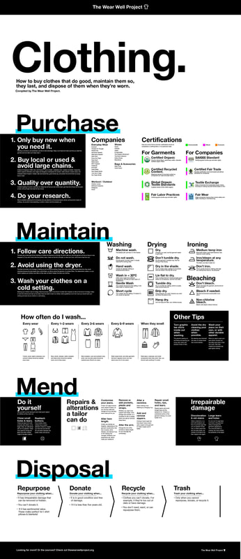
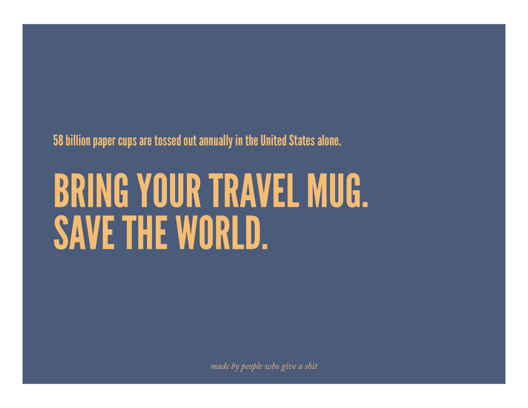
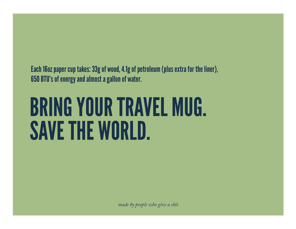
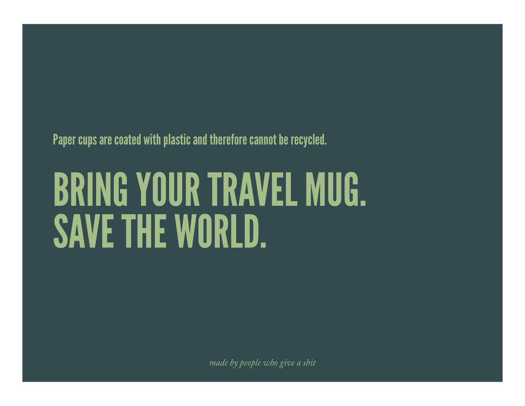
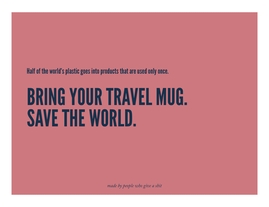
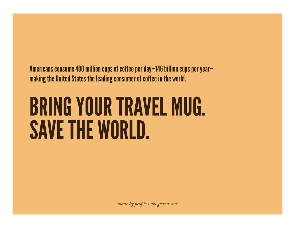
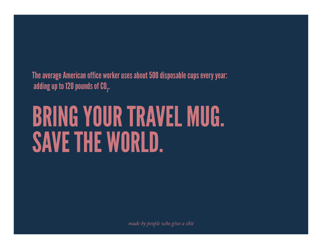
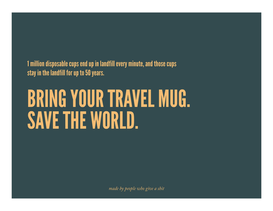
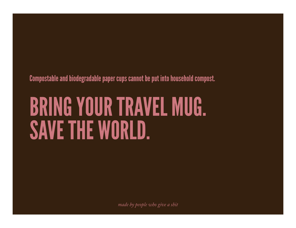
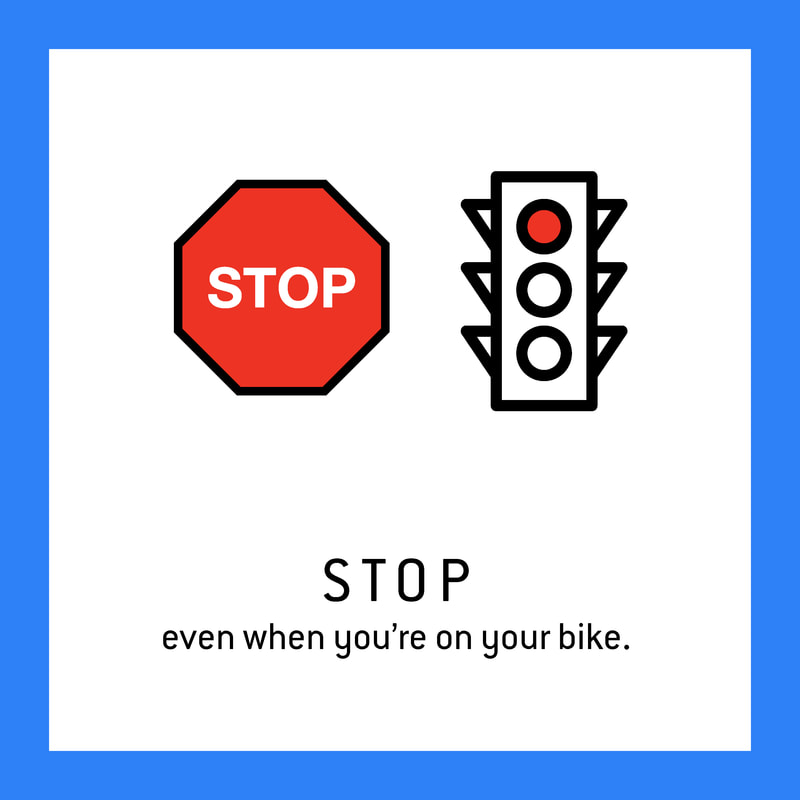
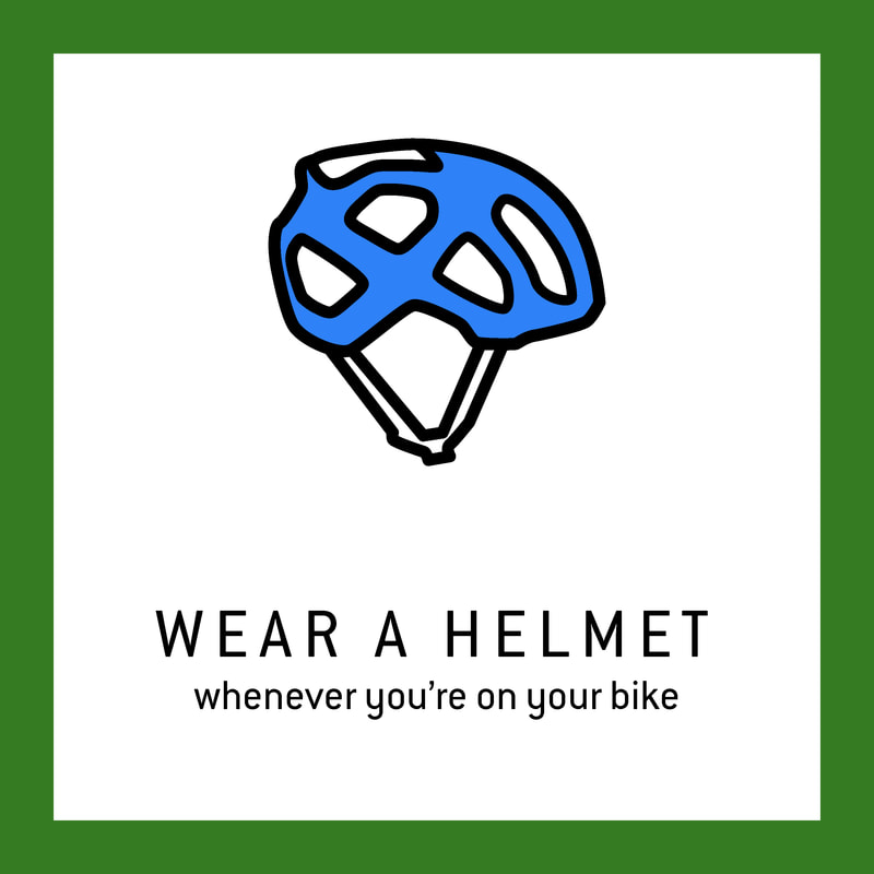
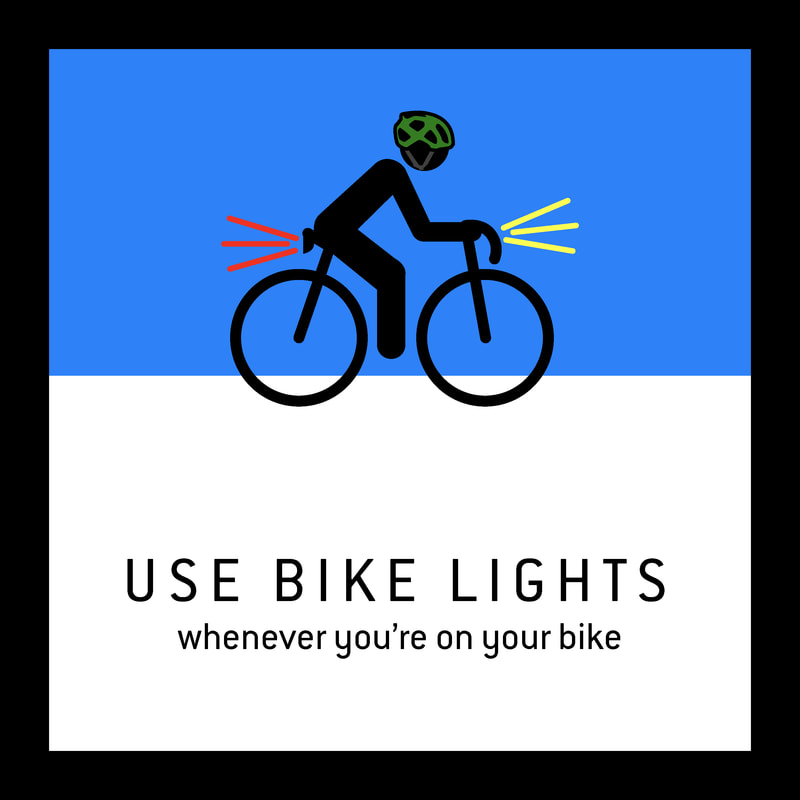
GoalsThe goal of this project was to spread information about the impacts of clothing, and what you can do about it. To accomplish this, I created four pages on a webpage and an Instagram account. The Four pages are the home page, which cycles through photos relating to the industry. The Facts page give people some unambiguous information interjected by some images relevant to the topic. The You page I wanted to be the most accessible; this page is where you get the information about how you as an individual can take action to reduce your impact with clothing. Lastly, the Join page has posters to download, so you're able to take the information with you. I also started an Instagram page (twitter is dead, and Facebook is dumb), where I have been posting some of the facts from around the website while adhering to the brands aesthetic. The target of the Instagram is the eco and ethical brands (to do collaborations and build community) and their consumers (to enact change). Behind the nameAt first, I chose the name Wear. THen when looking to get a domain name, I discovered wear well was already taken. So then I added, "The" and "Project" I added the both because without the "The" it The Wear Well Project had the same acronym as the Wounded Warrior Project (WWP), as well as sounding awkward without the "The." I used the word wear because it applies to how we use our clothing (wearing them) as well as how they age. The well developed both because I liked the alliteration of the WW and because it is the proper modifier for the word to visualize the action I would like people to take; being better, doing well. Brand IdentityColor pallet. I used a variation on the CMYK color pallet. I wanted the information to be clearly and unbiasedly (ish) presented, and the CMYK color pallet enables the clarity, while also being punchy. The Typeface. I chose Helvetica for the same reason I chose the color pallet: I wanted it to be unaffected and to influence the understand the text minimally. I also really love Helvetica. The Iconography. I like having a strong iconography use, and with the three in the photo above* I don't think I did as well as I could have, but throughout the rest of the work, I did a lot of like drawings of clothing or other symbols where were consistent and well used. I used the icons this way * Currently, I can't get the picture to load, and I don't know why. WEbpage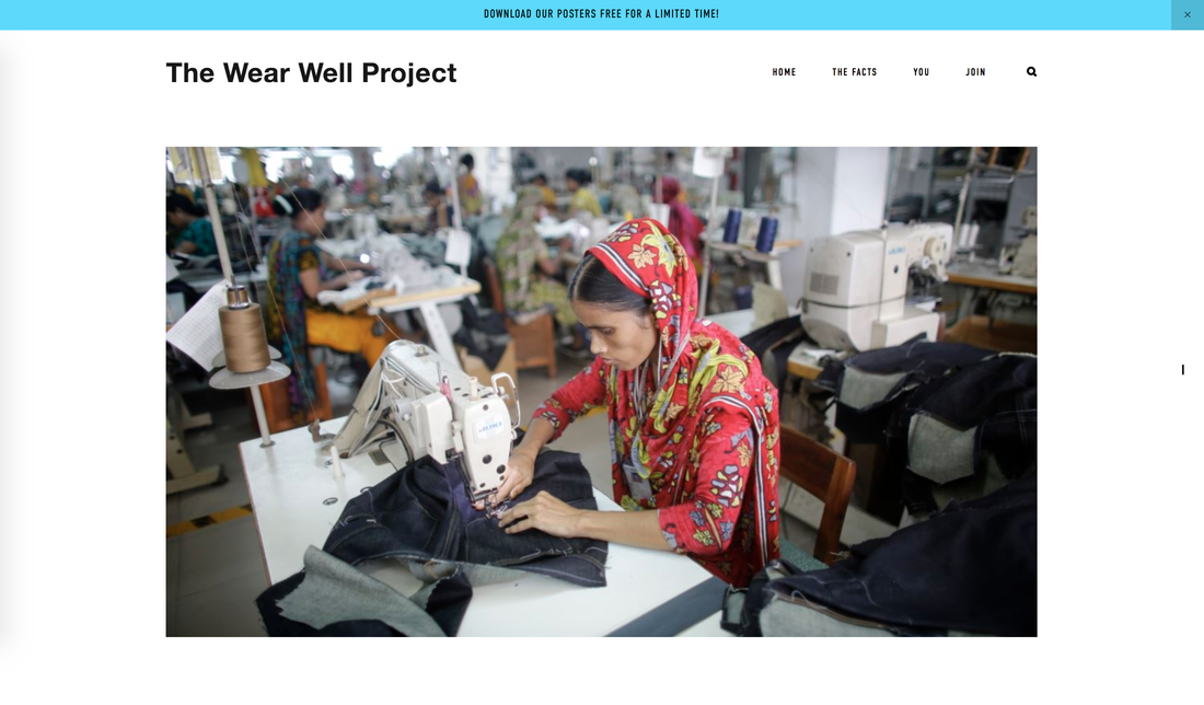 UPdate with wordsI feel mostly behind and stress, I am not enjoying this project at this point, and I feel like it is because I am not getting more consistent motivating feedback. With classes, I am used to getting positive feedback from each project I make, which fuels me to create more projects, but I am not getting that with this project, so I am feeling unmotivated. I am also feeling unmotivated in all of my projects, but this semester has just be so shitty. I have never been so bored and doing so much But I am getting lots of work done, which is good. House pants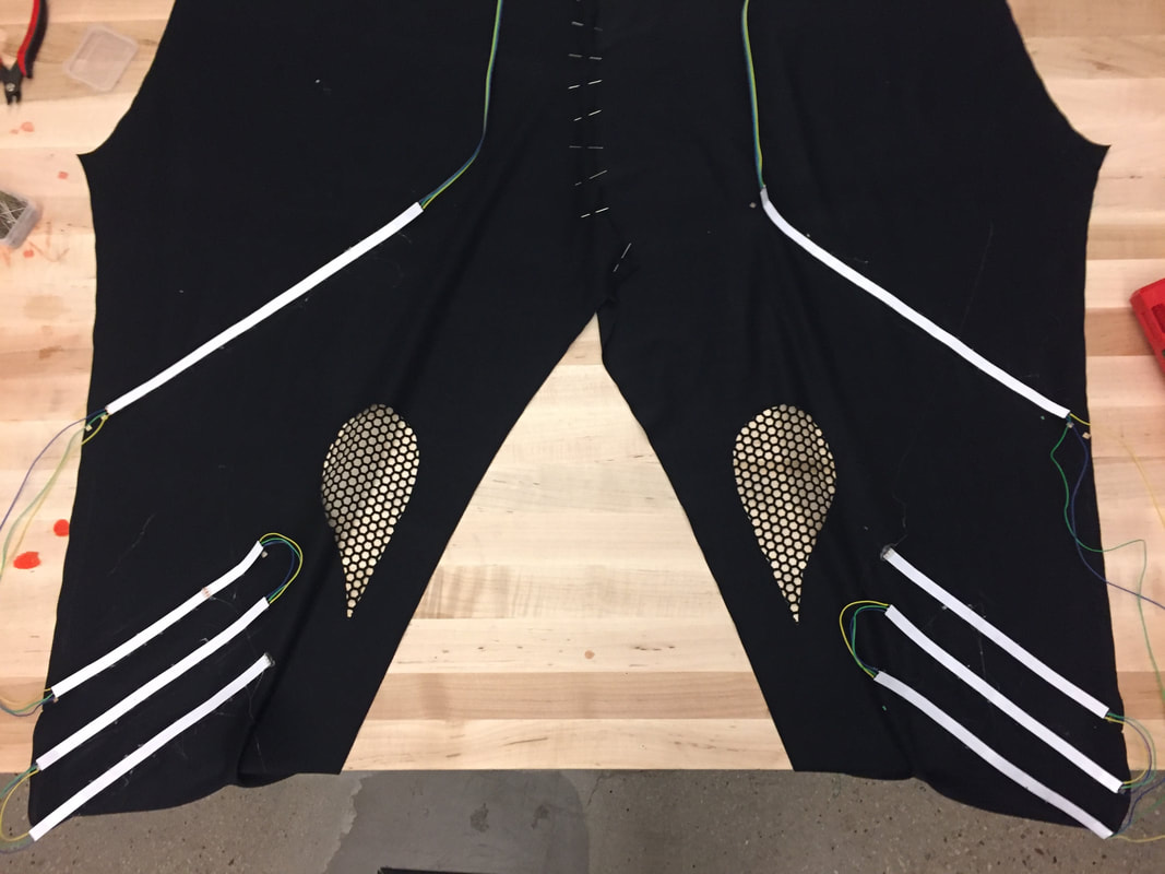 Hip hop pants
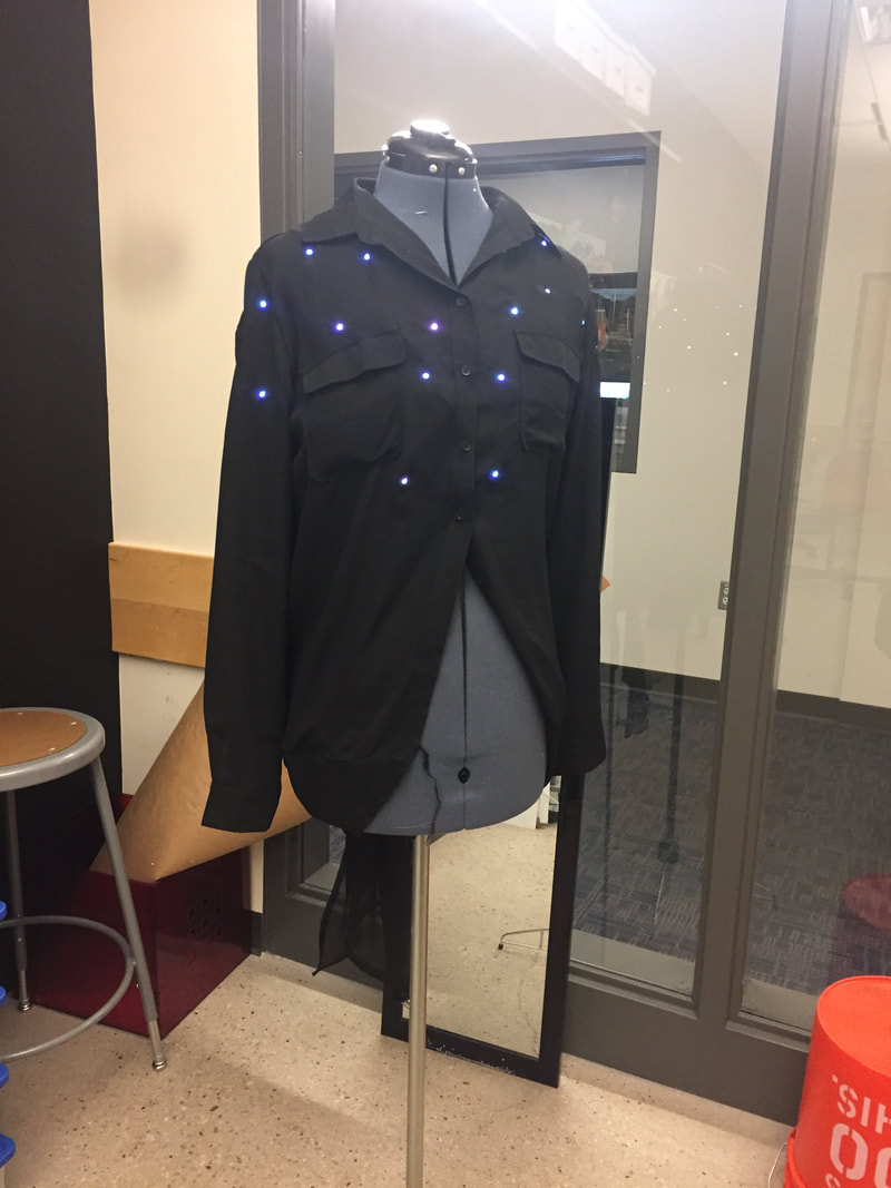
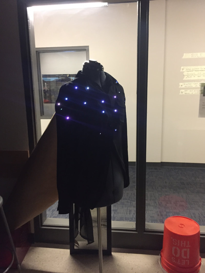
Contemporary Shirt
Aerial Top & BOttom
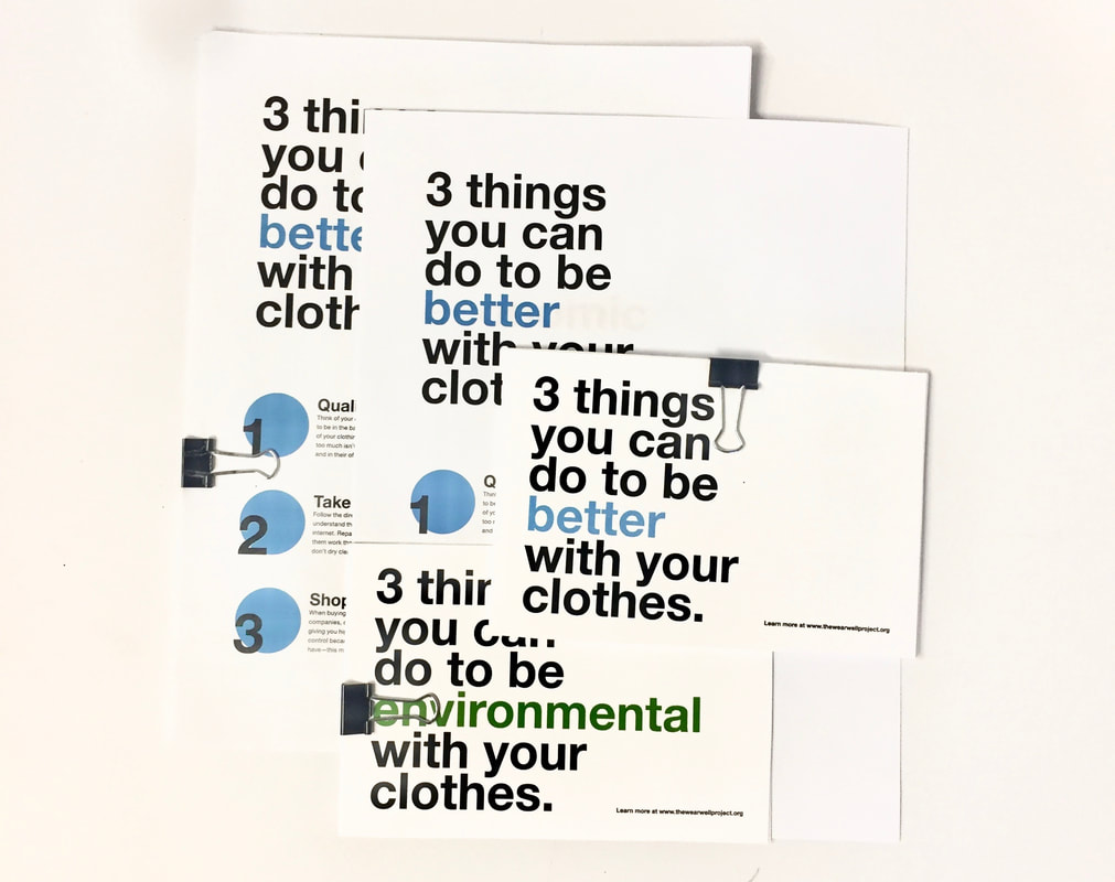
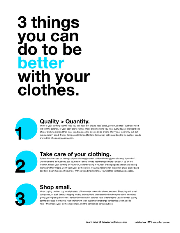
 Link to online card right here.
Overall progressThis week has been pretty productive! I am getting anxious and stressed about school in general lately, which through procrastination of other things fuels the creation of wearables. This week, I started and almost finished the hip hop shirt, all I have to do left is the coding and the cutting little holes for all the LEDs. I also have done almost all the soldering for the contemporary dancer top and pinned the soldered parts to the top. This week I'll be gluing the LEDs to the top and coding it as well, and then it will be done! I also soldered the bottom of the aerial costume and started pinning the microbit in. I have soldered all the LEDs into the front of the briefs and almost finished sewing the skirt. The next steps for this one is adding LEDs to the skirt, and then putting all the pieces together. I am a little anxious to sew the whole thing together because of that's the last step. I still need to add elastic and leg binding and a liner... I am also almost done with the top. I have been a little frustrated with trying to make it fitted, without having tons of seams. Last week I added the shoulder portion, but I am not happy with the stretch panel I have the should to allow mobility, but I think its the only way I can do it. Its a little asymmetrical at the moment and I can't figure out how that happened; I have been cautious. So I am adding darts at the bottom and going to hold my breath and attach the elastic so I can put the LEDs in. Kinect ProjectI have also been working with Annie Kelly to try to create a non-wearable related interaction with dance. I am not really in love with anything I was thinking of for the ballet dancer, so I wanted to develop another way to have an extension of body interaction without having to change the costume in a way that would no longer represent the form. So what we are going to do is have kinetics at the front and side (and maybe above) the dancer, and projects on all side of the cube except for the floor that would project the pathway that viewed from that point of view. So if you lift your arm up straight to the side, on the front and back facing walls, you'd see a c curve around your body—but from the sides, you'd see a straight line. I then want the lines to be delineated by color for a body part. The lines taper from the start of the pathway to the completion. And later, depending on who the dancer is interacting with, I want to change how long the lines stick around. When she is with the partner she is supposed to be with; the lines would stick around, and create this beautiful brightly painted room. But when she is with a bad partner, they're shorter and disappear faster. Think kind of how the Firebird piece with the Fairy in Fantasia when she can't get the plants to grow versus when she is building the forest up again. UROP Filming part 1Filming went well; we're doing more next week. We did the interview portion and the b-roll of me at my desk, getting tools, soldering, sewing, pinning, and coding. It was fun, and I enjoyed the photographer and film person. I am excited about this video, but I feel like I haven't done enough for where I should be on the project... But I think I'm okay? Who knows. Next week we are doing the second part of the filming, where I will be doing the dancing. I am going to try to have at least three wearables finished and on for next part of filming next week; where we will be shooting the dancing in the dark and doing some long and double exposure photography nonsense that will come out fresh. I am also going to participate in a music video for a local band with my friend where we dance on trapeze and silks respectively and filmed in front of an on a green screen with drones, which I am excited about. Issues / roadblocksI have also been having trouble with this power drop problem with the neo pixels in all of my projects. I am wondering if the Li-ion batteries don't have the amperage power the LEDs... WHich is kind of a big problem, because the AA batteries are big, bulky, and don't recharge well. What happens is that I put the code on the microbit, and the while strand of LEDs is red (despite being programmed to be white), and then when I plug a fresh battery in, they are white, but they are like the kind of white where you can see all of the colors. They are kind of purple from one angle, red from another. You can see this in the first picture at the top of the page, and then the longer the piece is on, it goes more and redder and then starts turning off. I don't know what is wrong with the code because I have had more LEDs run on a less charged battery with a brighter, more consistent color for much longer. I have no idea whats wrong! Because I don't have the dancers measurements, I keep getting stressed out at the idea that the dancers won't be the size that the wearables are. I want to have a specific dancer for swing, but I think she's around a size 8 or 10, but the skirt I made is a size 4, Which I can't let out. I think these might just be practice pieces that I use, and then I would have to make another piece for the dancer? But that sounds like a crazy amount of work... So I feel a little anxious-making anything but also know I need to finish these pieces. Getting towards the "fuck it" part of the project, where I'll just make stuff to make stuff, and if it doesn't work, that's that, and I'll just make more. #allnighters Next stepsI feel like I am perpetually out of material to work with, but my fabric box keeps filling up. I need to order more solder and neo pixels and get more fabric for the house, and hip hop pants. I need to choose my top 3 choices for dancers and reach out to them. I need Gary to respond to my email in which I asked him how many projectors are in the black box and how they are or and how I can position them. I need to know if the performance dates I asked Ben for are available. Summary: Stressed! Busy! Sleep
Goal of this project
Target Audience(s)I had a hard time deciding which direction I wanted to take the audience, and I am still a little undecided. I really would like to appeal to anyone that doesn't know, because I think education, of anyone, is critical. But I also don't want to make the message too generic that it then doesn't apply to anyone at all. I think the party-driven part of CU's culture is my target audience. They made poor decisions, often low on money, and looking for ways to demonstrate superiority through physical objects. The goal would be to increase clothing consciousness in this group. Consciousness is defined as buying second hand or from ethical brands, caring for and repairing clothing, and not shopping at large fashion chain stores. I toyed around with a few different tactics that I wanted to pursue. I want to educate more than anything, I really don't like making emotional arguments; they feel useless, and whenever I see them applying a direct appeal, I immediately ignore their message and organization. Data points They like to party and be trendy. Their favorite social media is Instagram, but are also active on FB. They are the oldest siblings and have a lot of close friends. They Don’t really consider themselves pro-environment, but were vegan for a short time, but aren’t anymore, but like vanilla soy lattes. They aren’t outdoorsy but drive a Jeep something. They like furry things and sparkly things and Grey's Anatomy. They have the second most recent iPhone, with a small crack in the screen. They shop at forever 21 and wear bear paws rather than Uggs. They are a college student or a recent grad, and they will/are working in comm or marketing .They care about animals and attend charity events, but don't donate. Directions I've been considering whAt i've made so farGoogle Search T-shirt poster 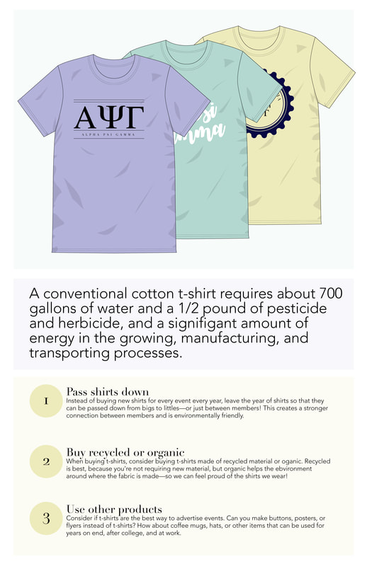 The ClassI have been struggling this semester with really not loving any of my classes. The projects are vague and seem unintentionally created, and haphazardly guided, the other students don't have the knowledge base I think should be required, nor seem interested in working hard to or getting better. I have multiple classes that I have no interest or fire behind learning the material. In my independent study, I feel a lack of guidance, but I am not sure how to ask for better leadership and get it. All in all, its been a hard semester. I feel a little dead-eyed and bored despite, even by my standards, doing an astounding amount of work. So having that moment in class to politely bitch about what wasn't working and praise what was nice to have. I am not exactly a quiet or reserved person when it comes to my opinions, but this had 56% of the time become a class where I was 100% more interested in what was on my laptop than what existed beyond the screen. I know the teachers care and teach is hard and a lot of work, yes yes yes, I know. But I similar to my independent study, I am looking for a little more guidance, and don't feel like I am asking the right questions to get better in the ways that I would like to. It was nice to see that some other students also had similar frustrations with the class as I did, but I am not sure what progress we made. I know this will be great for future courses, but I don't see what good it will do for this semester, which just frustrated me even more. I think I am just tired of being a guinea pig. I don't know what the point of this post was, other than my "one post per week" —Oh this is a perfect example of other people not doing shit!—It says one post per week, which I have been doing. Jesus people, get your shit together, these posts aren't that hard. Project 4 UpdatesFor project 4, I am feeling a little stuck. I have made a lot of mood boards covering all the topics that I would like to do and talked to Dan, which is typically helpful, but I feel like I left the conversation with more directions I'd like to take rather than feeling better about focusing my energy into one particular direction.
I do feel a little more centered on the fact that I am pawning part of this project onto the Advanced typography project. THere, I will make a substantial educational poster. For this class, I want to make short attention span informational thing. For a while, I was thinking about doing a drop-down menu or rolling bar kind of like with the gambling machine (no idea what its called). But then I had the idea (from another poster that was about abuse and someone's art project) of using the Google search bar and then autofill the things I want to connect large fashion brands too. In a perfect world, I would like to do this as a video, so I could have it delete and then type a new company name or thing so that I could encapsulate more information in 8 seconds of attention span. I want to do the drop-down style because I want to attach the idea that these large fast fashion brands do shady shit, and then I want people to feel guilty when they buy stuff from there (like how you feel eating at McDonald's, icky). And I want it to be accessible and easy and not fact heavy. I am not sure what else I would like to do... One of the kids in my group talked about making an information poster on how to care for your clothing, but I would want to present this information in another way than a poster. But I am not sure what to do outside of taking another large and irritating step of social media. Thoughts, anyone? Major progress / minor pictures 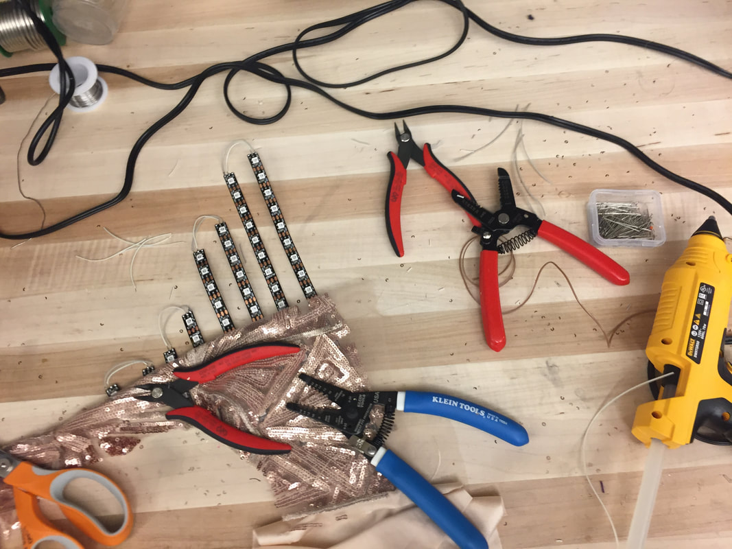 My workspace: Filled with glittery fabric and soon to be 'glittery' LEDs. Meeting about filming when well, the people talked mostly about how the process would go and scheduling how the filming will go. They asked me questions to develop questions.
I also almost finished the house and hip hop shirts, I completed most of the sewing and all I have to do the soldering and the finishing. I also sewed the LEDs into the bottoms of the aerial costume. I also talked to Laura Maury, who is a phenomenal swing dancer, and she seemed psyched to be in the piece!
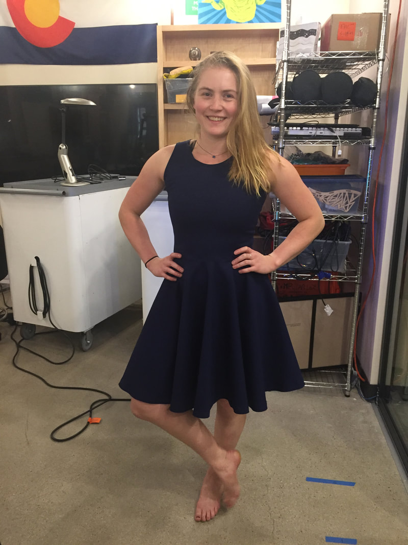
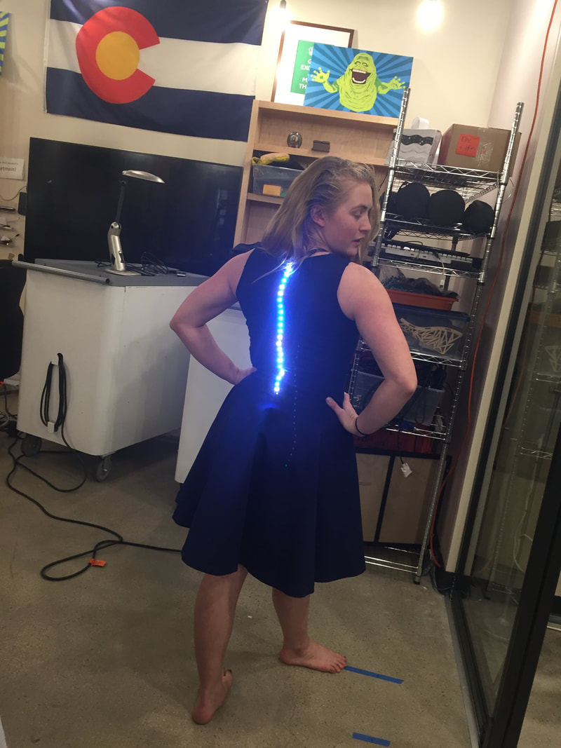
Dress Made for Meeting
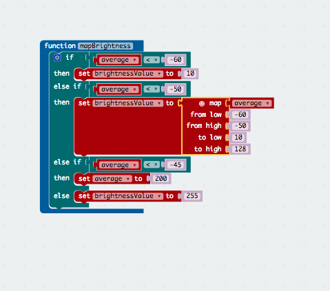
Went to the St. Julian to meet Micheal Savit and other members of the UROP team (the people who gave me the grant to do this project). I think it went really well, people seemed interested in my project, and I got a contact from Savit of a friend who owns factories in China, which will at the very least be interesting. I am curious about how garments are produced and I hope this will be a more real-world information. FUnction for brightness
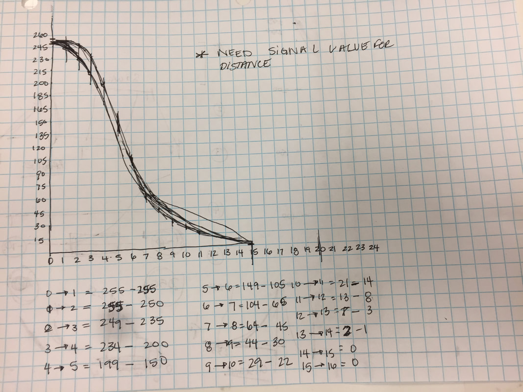
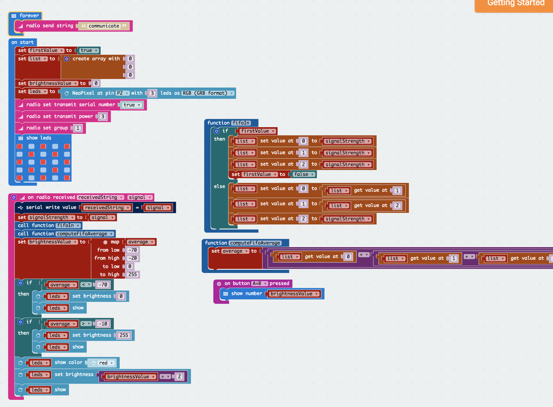
We worked out a few errors in the code, there is still the -works with last signal received problem, but that I'll fix later. This week I have been working on creating a better function for the brightness to create the effect I want. I drew a graph and then did the distance values, which I have from a chart I made a while ago, but need to update because I changed the signal strength... But thats just hours.
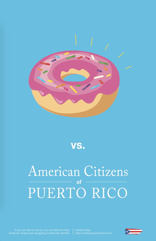
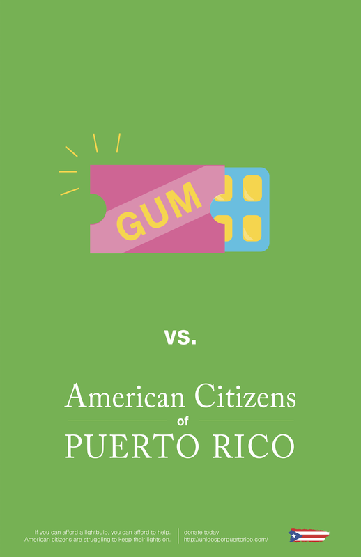
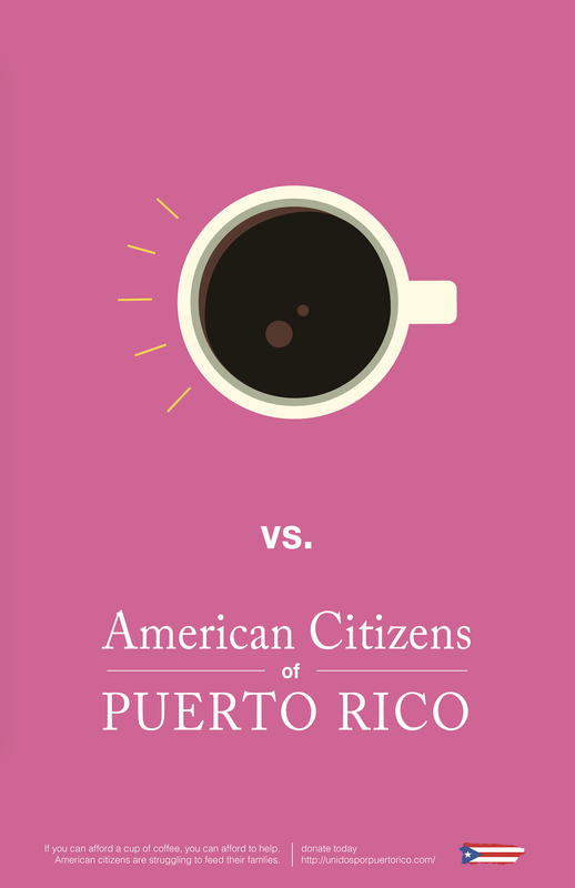
Final Posters: Square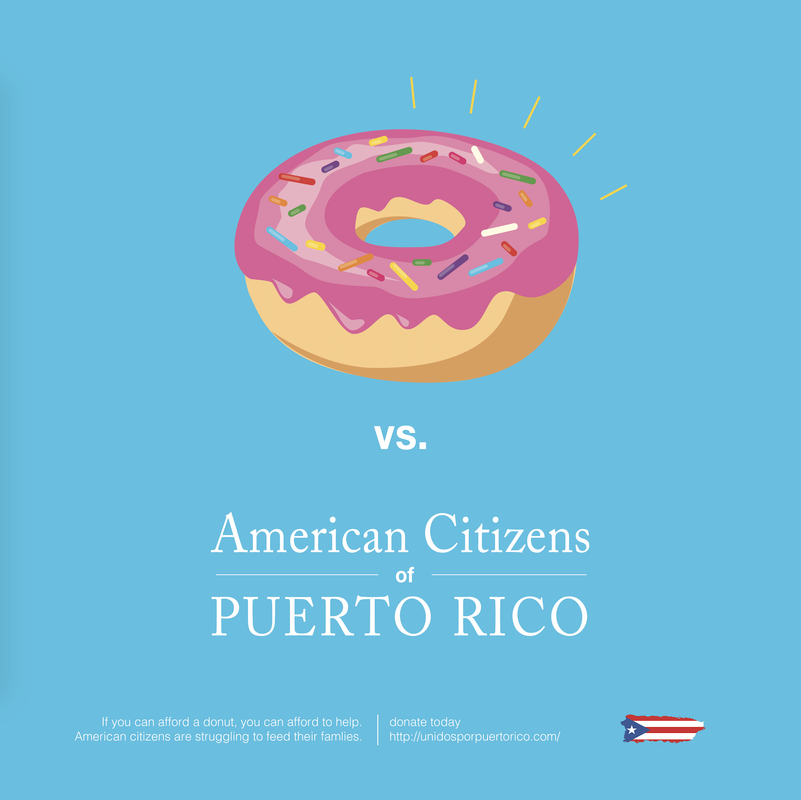 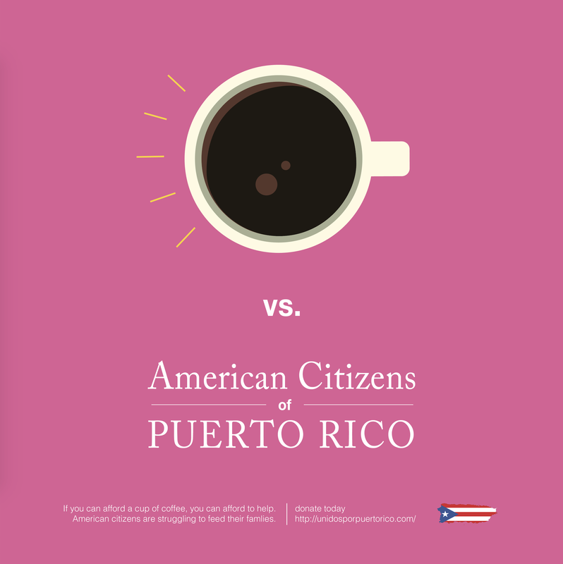 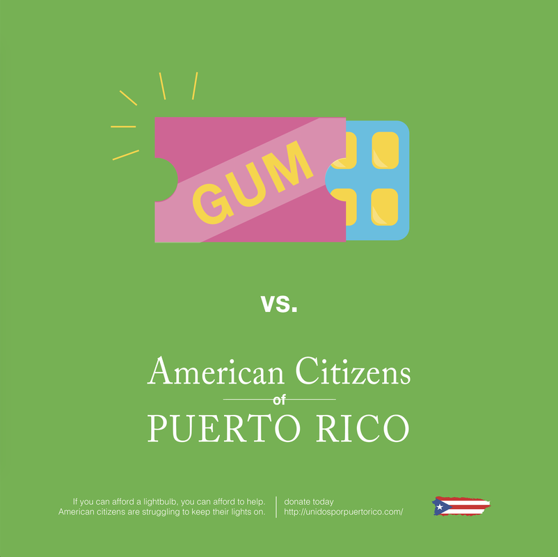 This project is over! Whew, I don't think I have gone through more major iterations on a project than this one in a while. I'm still not 100% happy with it, and I can't put my finger on quite why aesthetically, but it is turned and done, so I am feeling a little done with it. One of the other reasons I am not super duper happy with this project it because it deviates from the original message I wanted to convey. When we started the project, we agreed on the project topic of education about which territories the US has because of its significant influence on the likelihood of individuals donating to hurricane relief in Puerto Rico. It ended up being a more simple "if you have a few spare dollars to treat yourself, help out the people of Puerto Rico." While the poster says "American Citizens of Puerto Rico," which seems obvious, might not be obvious enough. The study we based out topic choice on provided the studied individuals with a paragraph about how Puerto Rico is related to the US. So I'd give it all like an 87% in my book, pretty ok, but also kinda meh. Social Media post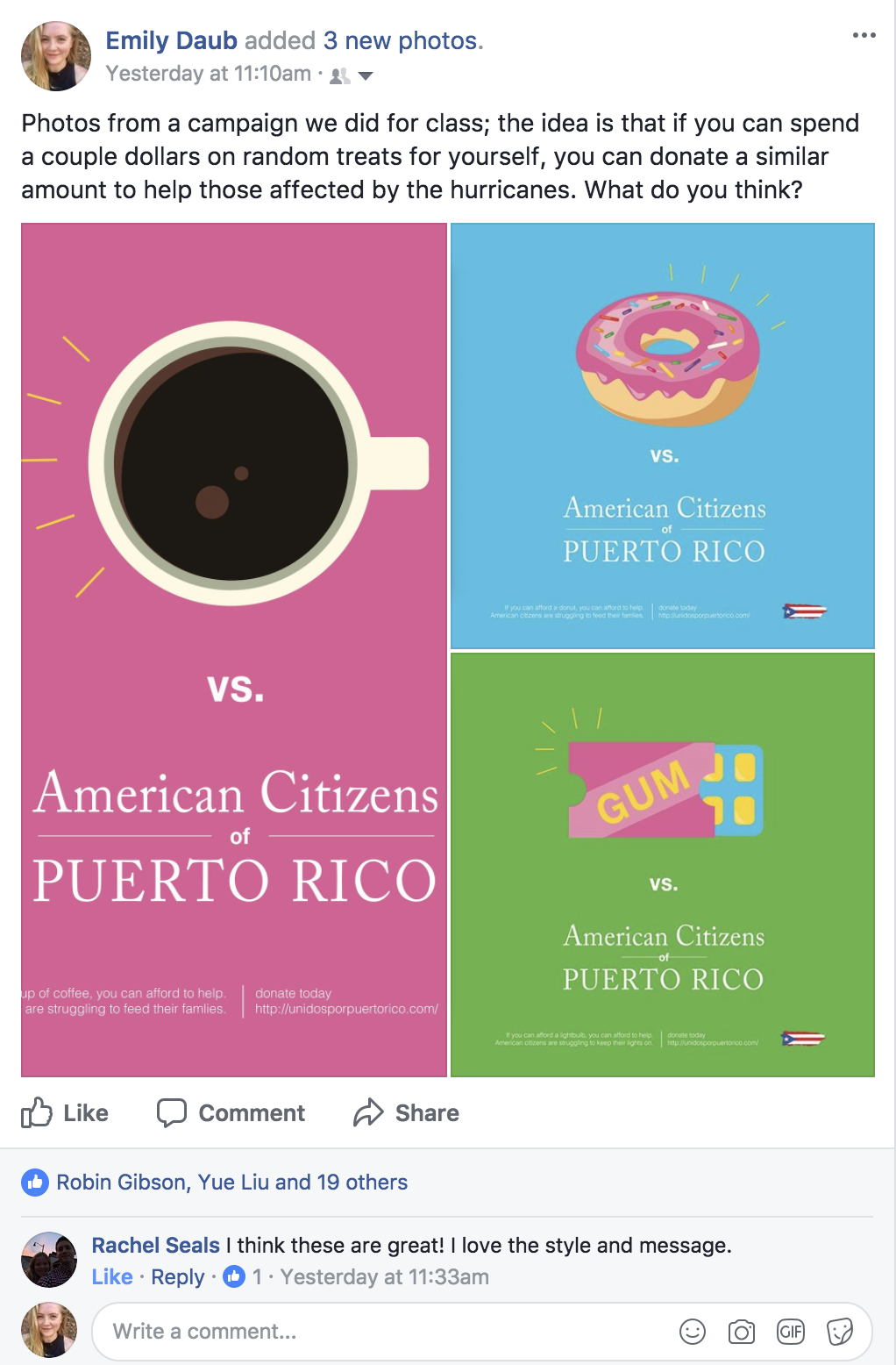 I posted this on social media, with a little bit of engagement. People overall seemed to like it. Considering that the majority of what I post on FB is about projects I've done in school or work success, the bar might need to be a little higher than this solid "meh" rated project. POsters
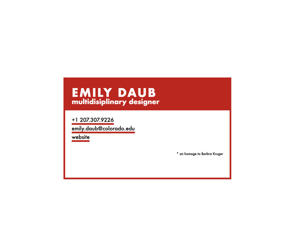
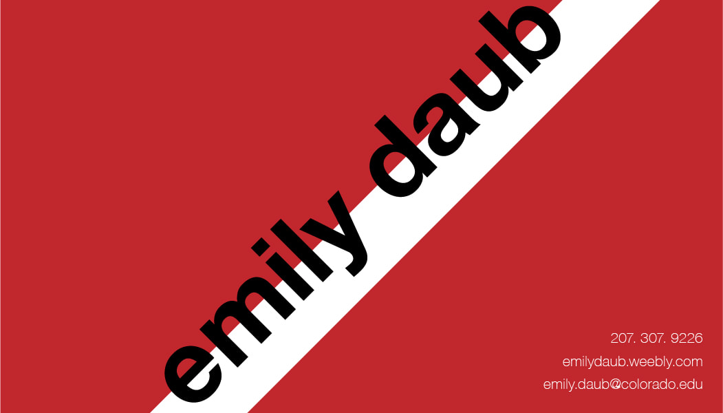
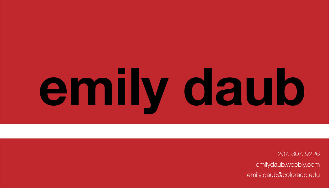
Final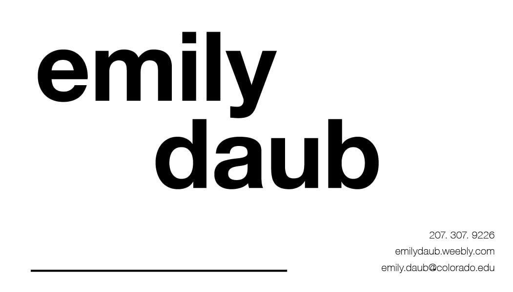 I love International Typographic Style; its detachment and directness. International Typographic Style (ITS) embodies what I try to embody as a person and in the design, I create when I get that freedom. So I had a great time creating these business cards, which came at a perfect time—I've been meaning to create a new one. With this one, I started with Helvetica. Then I added some color, as is consistent with me, I didn't like the color at all in any shade and removed it completely. The final version places focus on the whitespaces between the descender of the 'y' and ascender of the d. I also used lower case letters both because minuscule letters are characteristic of ITS and also because I hate capital Es and D's: they're vertically asymmetrical which I don't like in capitals (except in J and N). It also uses the dramatic hierarchy of ITS with the large focus and much smaller other information. A detail on this on that might not make sense here is the line at the bottom right of the card. This line is for me to fill in whatever the relevant description for the person I am giving the card to. Sometimes I'm a graphic designer, a wearables innovator, an apparel designer, and other things, and I wanted a place that I could make one business card could serve the multiple purposes I fulfill as a creator and designer. ITS also has such a void of voice that allows my different disciplines to be served by the same card, which is great. Iterations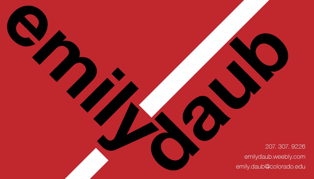
Last week we had like the second real discussion that we have had in class all year. I wish this class was more of that; a harder analysis on our ideas and the rhetoric around it, and then how to communicate that position effectively. I wish we could discuss topics in smaller sections: I think that would be more effective for getting students to talk to one another. With a large class, we really don't have time for everyone to state their positions and the reasons (or more often, the lack thereof), behind them.
That Christian guy really gets under my skin, mostly because of his fundamental misunderstanding of how the healthcare system works. Healthcare providers provide a service that they pay for. THey are not just giving away health care. You make a bet that you won't get sick or need healthcare, and then the healthcare company evaluates that bet and gives you a fee that you pay on a monthly basis, so that, in the case you get sick, that money goes to your health care. Meaning, sometimes the healthcare company lose the bet, which is why there are premiums because they won't have you go over however much you've paid to be worth. And that's not the best explanation, I know, but the Christian guy's logic was that the health insurance people are paying for your healthcare. And they're not. You are because you purchase health insurance. Now, it would be different to say that some doctors should be allowed to prescribe or not prescribe contraceptive measures, but that would go against HIPPA, to cause no harm and help to the best of the doctor's ability. I know my views are liberal in general, and I do wish we had socialized healthcare; I think it would be a better situation overall if we implemented it, in the same manner, other countries have before it, but I also try to examine my opinions. So there. My updated Version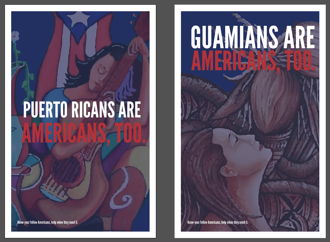 McCall's Version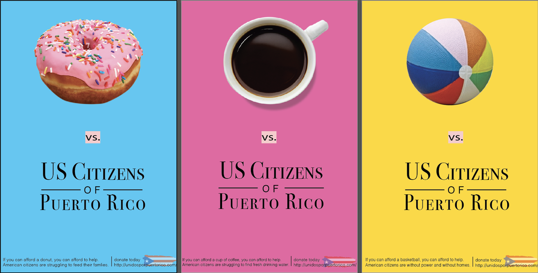 Round one posteRI updated McCall's poster, and refined the typography and changed the color (yellow never prints how you want it), as well as center the content tighter in the middle. 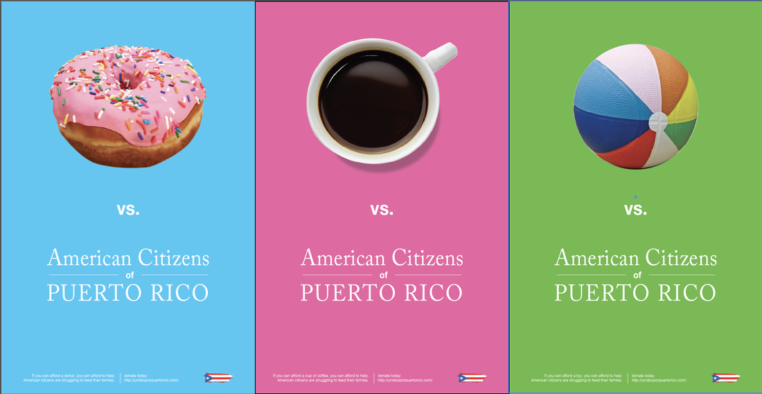 1.Three examples of typography tied to brand identity.
2.One example (at least 3 images) of brand typography evolving over time.
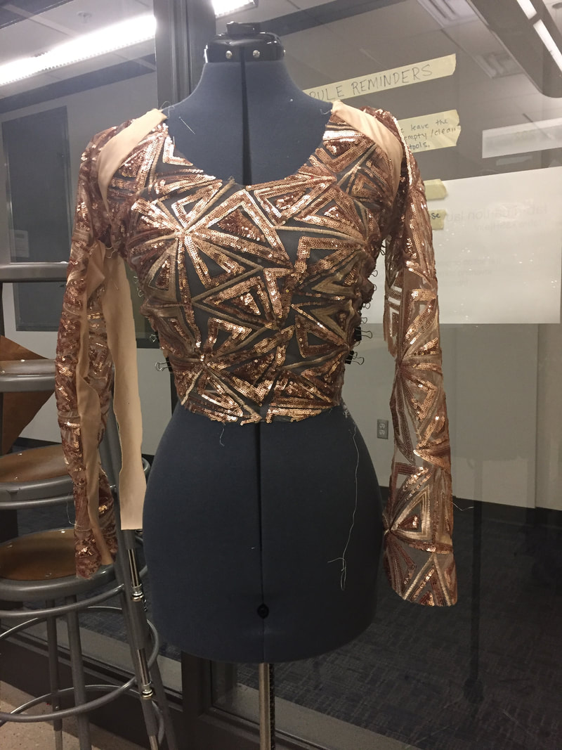
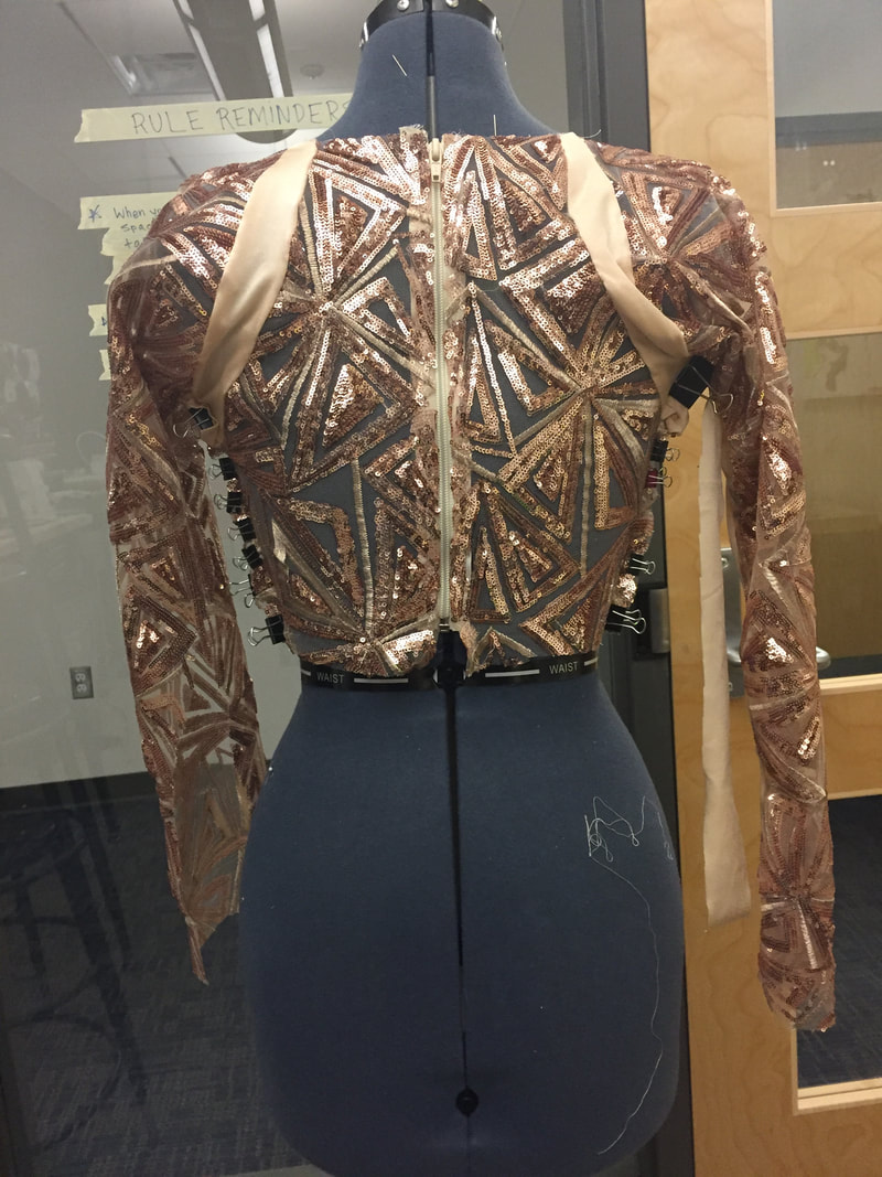
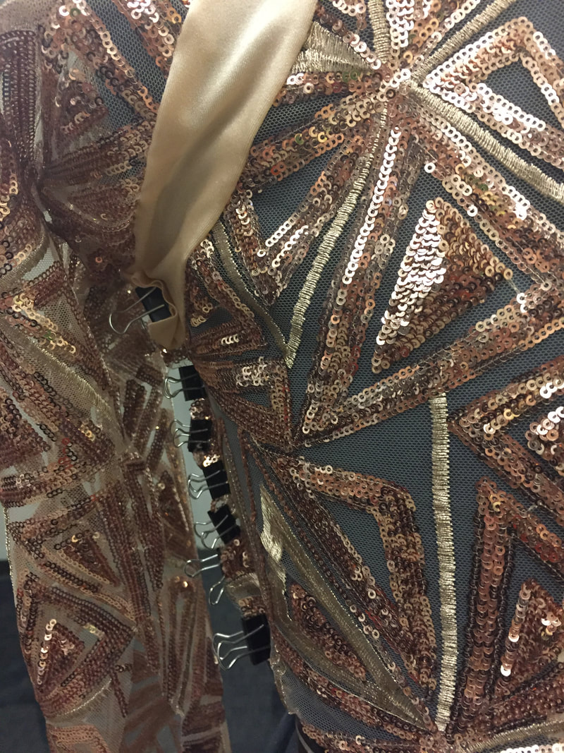
Aerial top
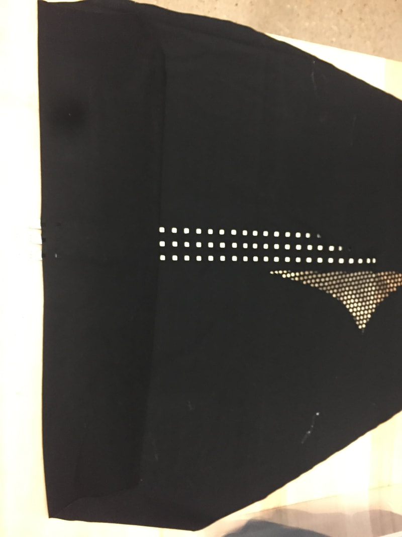
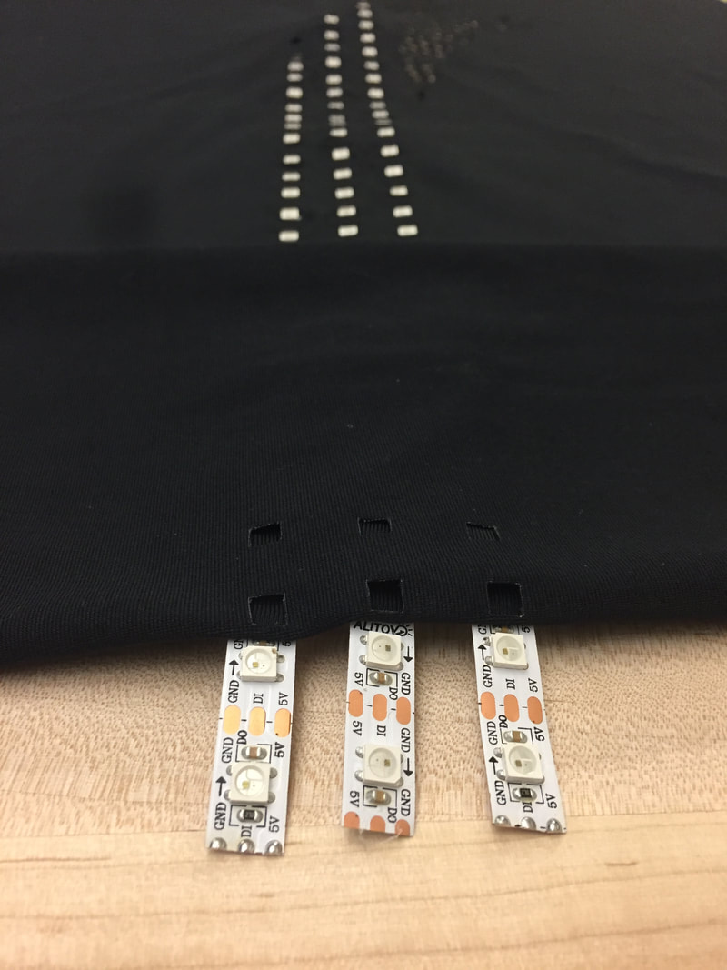
I completely cut the pattern. Which is terrifying. This fabric was quite expensive and I don't want to have to buy more... I decided on a raglan sleeve because I thought it would help with movement. I also haven't closed the arms yet so I can put LEDs on the inside of them. The sequin panels have some stretch but will have another layer of no stretch lining behind them with the LEDs on that layer, which is why there are lycra panels between the seams in the shoulders and on the sides to create stretch along those seams. The bottoms have been cut, but I haven't started to put them together. I wish there was a dress form for bottoms... Swing Skirt
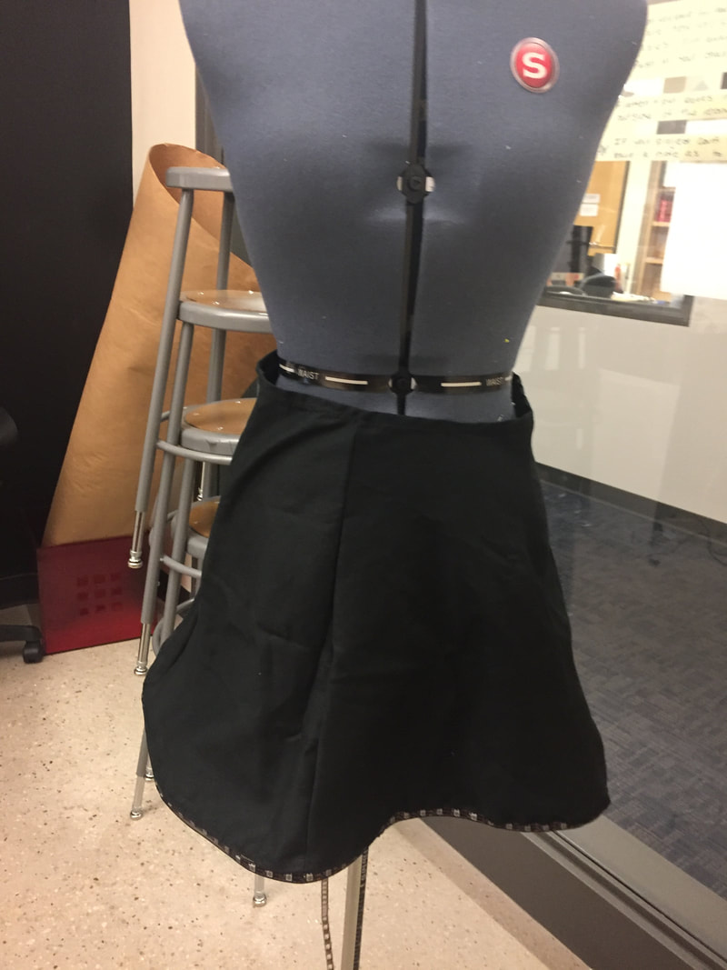
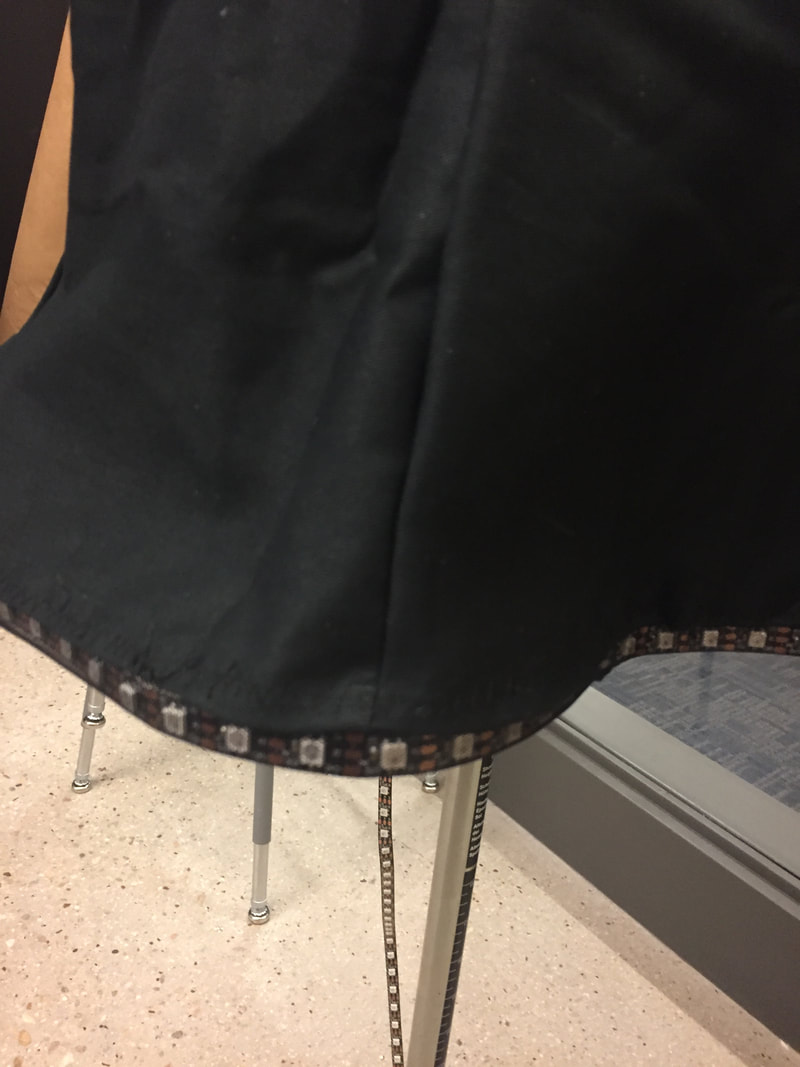
For the swing skirt, I used a simple A-line skirt (so popular with sorority girls on football game days these days), instead of-of the traditional circle skirt for swing dancers. I thought this would be better to pair with the house dancer because it was a more fashionable skirt for the times. For embedding the LEDs, I tried a new method, since the swing skirt isn't circle and won't flatten out when the dancer spins, I couldn't put them on the inside of the hem, and the fabric was too tightly woven to shine through the fabric effectively, so instead I made mesh pipping that I threaded the LED strand through, and stretched it to the hem. The only thing that is missing to completely finish this on is soldering the LEDs to the board and making a pocket for the board and batteries. Also, it looks like it fits a little weird on the model, but I made the waist a little bigger than the setting on the dress form when the picture was taken. This is so that if the dancer is bigger, It will fit, but if they're smaller I can size it down with stitching and adding elastic.
Up to this point, we have been exploring the history of printing and typography. Has this changed your appreciation for printing today? Has it influenced how you approach typography or design?
Answer: I have always been interested in the history of the things I like, which include mostly just objects: particularly clothing and stuff we use... like chairs and buildings. I took History of Design, History of Fashion, and history is mentioned in every single TAM class that I have taken in my time at CU, and I liked to think that I have learned a lot. However, in this class, I haven't really learned anything new that colors my perspective on design or has any particular influence on how I design now. I watched the Linotype documentary and haven't heard a new name, although I did learn small new tidbit like Gill San's creator's incest, but those haven't dramatically changed my perspective. Learning design history doesn't really change the way I work, but I make more decision more consciously. The more examples I see help me develop my aesthetic. I like Swiss/International Typographic style, and type-heavy everything. I hate unconsidered decoration and people trying to be too deep about stuff. Many artists try to make feelings, particularly negative feeling, so much bigger than they are and bigger than they deserve to be. It is self-indulgent and juvenile. I find this is design classes a lot, the fuzzy line between designer and artist. Sometimes design is art, and sometimes art is design, and other times they are both their own categories and don't need to be mixed. This perspective has come from learning about history and seeing what stands the test of time. Our group started talking about the topic that we wanted to do, with the constraint of needing to replicate the idea in a three-poster series. We settled on education about the US territories and letting people know about them. In primary education, we learn a lot about states rights, but we learn very little (or I remember very little) about US territories. In an NYT article, when asked if they would want to contribute to Puerto Rico if they knew that the people of Puerto Rico were American citizens, they were almost twice as likely to donate to Puerto Rico's hurricane relief. We wanted to spread awareness about our territories so that people would be more inclined to help their fellow US citizens.  |
archive
January 2018
topics
All
|
|||||||||||||||||||||||||||||||

 RSS Feed
